Hello world of Dynamo,
We are super excited to show you the epic Dynamo 2.13 release we have been busy working away on, a release that is even bigger than the previous Dynamo 2.12 which required two full blog posts… this one requires three. Bigger is better right? Right…? This release encompasses the Dynamo Visual Refresh, a huge set of works that touches the majority of all things Dynamo and introduces new features, new paradigms and new behaviors. Come with me on a journey through all of the funky things we’ve got in store for you. We wanted to crank the volume up to 12, so we cranked up the number of folks working on this release in the great modernization!
TL:DR
- Visually reimagined and refreshed Dynamo experience, introducing a modernized user experience, fresh color scheme, tonnes more information at your fingertips and clarity towards both paradigm and approach to how Dynamo works; nodes, wires, authoring behavior and the UI experience have all been jazzed up [Part 1/3].
- Implementation of two Dynamo Interactive Guides for First Time Use Experience and Packages, with more to come[Part 2/3].
- A refreshed Package authoring and download experience [Part 2/3].
- An expansion to the Workspace References extension to include local definitions and external files [Part 2/3].
- We now have a richer way to handle installed packages via states and resolve conflicts [Part 2/3].
- New Unit nodes [Part 3/3].
- More seamless Python 3 Autocomplete [Part 3/3].
- Performance improvements to Search, the scaling of graphs and the Virtual Machine improve Dynamo use [Part 3/3].
- A swathe of security updates [Part 3/3].
- A new node that groups curves together [Part 3/3].
- 35 bug fixes, with a particular focus on Crashes to improve stability of the overall Dynamo experience [Part 3/3].
Phew… a monster list! As usual, there is a whole bunch more so please do check out the release notes!
What is Dynamo and its flavours?
What is Dynamo Core?
Dynamo Core is a collection of bundled components that consist of the graphical interface, the compute engine, the scripting language DesignScript and the out-of-the-box nodes that are not specific to another program like Revit or Civil 3d.
What is Dynamo for <INSERT HOST HERE>?
Dynamo for [Revit, Civil 3d, FormIt, Advance Steel, Robot Structural Analysis, or Alias] is a collection of host specific nodes that work with Dynamo Core and runs inside of said host.
What is Dynamo Sandbox?
Dynamo Sandbox is for package developers and other folks working with Dynamo code who want to stay up to date with the latest and greatest stuff coming out. Sandbox is Dynamo’s “Core” functionality distributed in a way that doesn’t interfere with other Dynamo installations and doesn’t require any other applications (except for a few windows components and some optional extras). You can read more about this distinction here.
Where can I get my hands on <AWESOME NEW FEATURE or IMPROVEMENT>?
Right now, you can use all of the following Core content in Dynamo Sandbox, and we plan to make Dynamo 2.13 available in our host integrations at a future date.
So, what fun stuff can I do with Dynamo 2.13?
Dynamo Visual Refresh and Modernization
We are super excited to release a whole bunch of work reimagining, modernizing and refreshing how Dynamo looks, feels and is used. This work retains the power and potential of advanced users, while creating an environment that more gently introduces new and intermittently returning Dynamo users.
The theming of Dynamo switches to dark grey, aligning to the Autodesk Human Interface Guidelines, that modernizes the look and feel and also brings cohesion with your favorite host application. Highlight colors draw focus to important elements such as run modes or notifications. Nodal landscapes are enhanced through shape, color, and visual access to context menus. Hidden actions and behaviors now visibly surface. Fun!
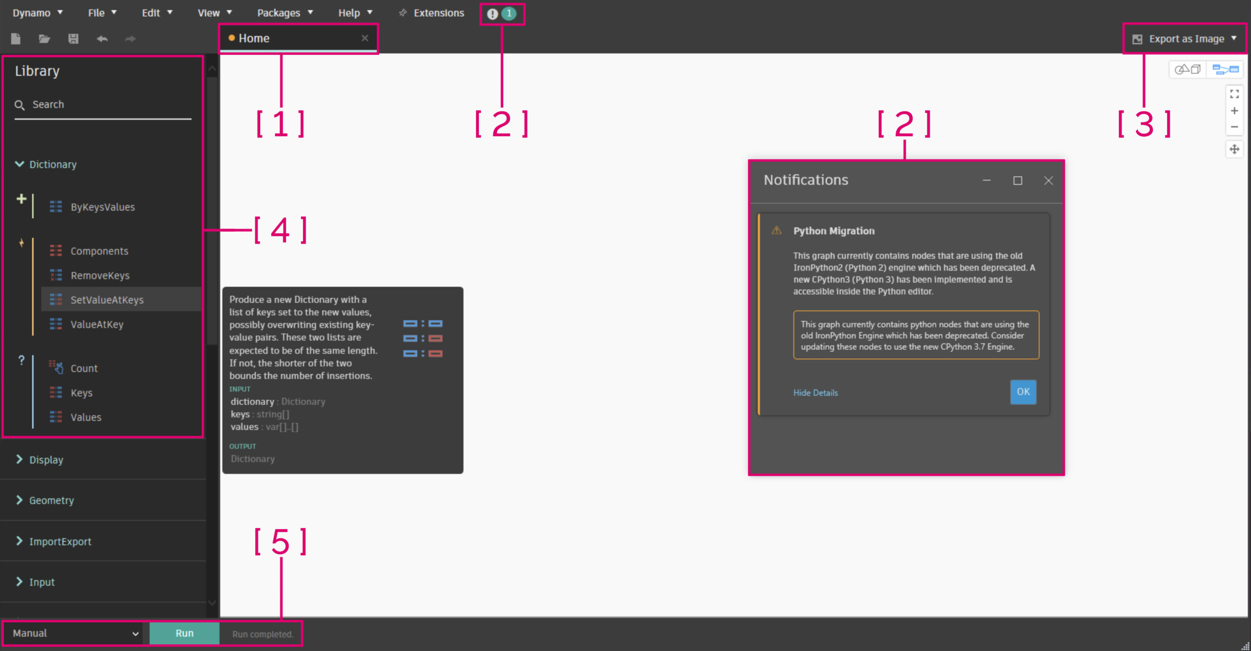
- [ 1 ]
Restyled workspace tabhas an orange dot showcasing the workspace is unsaved, and hover text indicating status. - [ 2 ]
Restyled Notifications windowandiconsurfaces information in a much more legible expander format that honors Error and Warning states. - [ 3 ]
Export menusnow accessible from both graph navigation and 3D background preview views. - [ 4 ]
Modernized Librarystreamlines information in a clear, tree style view, with enhanced clarity around searching and filtering of results. Minimalism for the win! - [ 5 ]
Restyled Run modescall out importance and introduce hover help text to clearly articulate what each run mode does.
Dynamo User Interface Visual Refresh
A brand new node design, dark themed in alignment with the UI, focuses on surfacing hidden options. This is achieved through the introduction of left-click context menus to compliment the retained right-click access, visually distinguishing port states, restyling the preview bubble and tooltips, and adding icons to the node header.
All of this is in service of accessibility (Tablet users rejoice!), clarity (Where seeing is believing) and definitive state changes to demarcate node conditions (Stuff gets more obvious!) and care has been taken to ensure that contrast is high, color blindness has been taken into account, muscle memory is preserved, and graphical representations are visually unique. A modern node for a modern world!
- [ 1 ] Clarity forward
restyled tooltipsacross all hover interactions in the nodal space. #stylish! - [ 2 ] Input port context menus now also contain the
Use Default Value option. Accessible via the chevron ( > ) or right-click on input ports. - [ 3 ] A
restyled preview bubblenow shares the same base colors as the restyled Watch Node in the dark theme. - [ 4 ] Nodes now have
iconsanchoring the node header to draw parallels back to the Library. - [ 5 ] The
renamed node iconis now much more subtle, and recolored to blue – the new informational state color across the Visual Refresh. - [ 6 ] Any port that requires information to successfully execute the nodal function will show as
unsatisfied with a vertical red band– guiding you towards parts of your graph that need review. This changes to satisfied as soon as you wire up a connection. - [ 7 ] Ports that do contain the required information show as
satisfied with a vertical blue band. This changes to unsatisfied as soon as you unwire a connection. - [ 8 ]
Default port valuesare shown with a vertical blue bar outside the nodal space to indicate that this port has a default value and doesn’t necessarily need to be wired up for the node to return a result. - [ 9 ] Nodal
preview statesare now shown via two expressions; an eye icon next to the lacing icon, and in the new node status bar at the base of a node, colored grey. - [ 10 ] Using
Levelsandkeeping the list structureare retained and restyled, still highlighting the entire port blue and adding in the List@Level scrollbar. - [ 11 ] The nodal
Context Menuhas its own access point on the node via left-click, and is restyled. Right-click on the node is retained for existing users to keep accessing the context menu with muscle memory.

Node Modernization and Visual Restyle
More control of Error and Warning States
To go along with our brand new node restyle, we have also put a bunch of effort into the Errors and Warnings states (Ooh-rah!).
On the backend nothing has changed… yet, but on the front end we now surface them in a clearer way, with some added funk. Restyled alert bubbles go hand-in-hand with the new node status bar color to enable zoomed out visibility, the ability to stack errors and warnings was added (Rather than just show the last one), and the ability to dismiss warnings that you have designed into your script; Null values? Yeah I know you’ll pop up, but I’ve designed in error handling into my script so we don’t need the notification anymore!
- [ 1 ] Default
alert bubblein its collapsed state, showing an updated icon. Alert icons have a hierarchy. showing in the order of; Error –> Warning –> Information (Hush hush, it’s another sneak peek!). - [ 2 ] Expanded alert bubble, showing
multiple errors, stacked. You cannot dismiss Errors. Note: Backend updates have to be implemented to catch this particular case as the missing semi-colon “;” is a breaking Error in Code Block Nodes. - [ 3 ] Expanded alert bubble, showing warnings. You can
dismiss each individual warning/informational stateas a category (i.e. any time this category of error comes back it will be dismissed) using the individualXvalue next to that warning. - [ 4 ] You can
dismiss allwarnings/informational states at once. Mmm speedy! - [ 5 ] Node status bar showing the
red error/yellow warning state. Note that this node also has its preview turned off, which is lower in the status bar hierarchy, but visible due to the eye icon above. - [ 6 ] When you dismiss alerts, they show up under the
Dismissed Alertscontext menu item, catching all dismissed alert categories. Clicking on these individually willundismiss themand revert the node back to its primordial state. Rawr. - [ 7 ] The
show lessbutton is the inverse of theshow morebutton, which showcases either the singular top Error/Warning/Informational alert, or all of them! Waaahoo for options. - [ 8 ] The
alert counteron the node is a visual indication at quick glance that this node has dismissed alerts, and tells you how many.

Modernized Error and Warning States
Enhancing the Graph authoring experience
Along with surfacing more information and a more cohesive way, we have burnt a lot of calories on improving the experience of creating Dynamo graphs.
Through allowing notes to be pinned to nodes (Friends for life), the ability to pin wires and place watch nodes along them (Rover, stay!), or simply hover to check the data flowing through that wire you gain more granular understanding and control of your graph information. A funky set of new wire selection paradigms allow you to more quickly navigate salient pieces of your graph, or hide off wires you do not want to see (Ciao spaghetti!), and massive updates to the Group experience allow for new description fields in conjunction with names, the ability to drag nodes into groups for a more useful creation experience, adding groups within groups to facilitate better graph organization (Groupception), and last but not least the epic ability to collapse groups to give you back screen space, hide off functionality that isn’t relevant to the primary graph level and treat all their contents as giant nodes. We’re super excited to get all these authoring tools into your hands, so take them for a spin and let us know what you think!
Groups have been given an upgrade, empowering them to be more useful, with richer features and cleaner ways to collect and display information in your graph. First, lets explore an uncollapsed group:
- [ 1 ]
Group titleallows for an anchor as to what this group does. - [ 2 ]
Group descriptiongives a more verbose description of what the intent of the Group is. We envision notes to make up the bulk of novel-based annotation beyond this! - [ 3 ] Groups now come with a
header barthat is clearly demarcated in bold with your chosen group color, and contains; Group title, group description, collapse chevron, and the context menu. The header bar will always be the horizontal length of your collected items to ensure when you uncollapse that your graph is legible. - [ 4 ] You can now
nest a child group into a parent group, or really as many children groups as you want! There is a limit to only one layer deep – so a single parent groups with as many children groups as desired. Go get organizing! - [ 5 ] The
collapse/uncollapse chevroncreates the magic. - [ 6 ] The group
context menu has also been restyledto match the visual refresh aesthetic. - [ 7 ] Dragging a node, or another group into a group allows for
drag and dropof items to get placed into that group. The outline will turn grey to indicate you are in this mode. So much smoother than right-clicking to add stuff. #Winning. - [ 8 ] The
group bodyis a lighter variant of the chosen group color compared to the header bar.

Uncollapsed Group with Nested Group
Having seen all the epic things you can now do with uncollapsed groups, let’s look at what surfaces when they are collapsed. Collapsed groups look and behave like a giant node, with ports from the contained nodes surfacing as inputs and outputs:
- [ 1 ] In collapsed mode, the header bar
hides off the group descriptionbut retains the group name. Bring on the cleanliness! - [ 2 ] However, if you hover over the header bar, you’ll see all that detail, including the
group description. - [ 3 ] The
collapse/uncollapse chevroncreates the magic. - [ 4 ] Ports from nodes inside a collapsed group
will surface on that collapsed groupif they are not satisfied (Wired up), or if their wire comes from outside the group. Nested group nodes will only surface ports if they are connected outside of the parent group, so you can use them as a way to keep contained content… err, contained! - [ 5 ] Any nested child group’s
name will show up in a liston the parent node alongside the node counter. - [ 6 ] All nodes contained within the parent group will appear on a
node counter. Note: Nested child groups and their contents are only surfaced via the group name and are not counted here.

Collapsed Group
Note: We have a few Known Issues around Groups, in particular how Code Blocks work with them right now. Please read the Dynamo 2.13 Release Notes to find out more.
Node selection paradigms, Notes and Wires have also been given a new lease on life, enabling better ways for you to build, annotate and understand your graph. Hurrah for more tools!
- [ 1 ] Hovering over a wire now gives you access to a
wire menu. This wire menu allows you toadd a pin(Or multiple) that acts as a control point on the wire,place a watch nodein that location and automatically wire it up and showcasedata flowing through the wire. - [ 2 ] When you hover over a wire, you can see the data flowing through the wire in a
data preview, that shows you which node this wire is coming from, which node it is going to and a truncated preview of the data flowing through that wire to orient you in a large graph. - [ 3 ] You can now
pin notes to a nodeby selecting both and using the right-click menu on the note. You can alsounpin by clicking on the pin icon. This means the note and node will act as one, traveling in unison! #FriendshipForever - [ 4 ] Right-clicking on a wire gives you access to yet more
wire options, with three actions you can take; You canbreak the connectionwhich removes the wire,select connectedwhich will select the nodes connected to this wire on both ends, or you canhide/unhide the wire, enabling you to visually hide wires you do not want to see. - [ 5 ] From any output port, you can also access (most of) the
wire menu, enabling the same breaking of the connection or hiding/unhiding of that wires. - [ 6 ] A wire that has been
pinned. The pin can be moved around at will, and will interact with all of the alignment and the Cleanup Node Layout (Ctrl + L) features. OCD clean graph people like myself rejoice! - [ 7 ] A hidden wire will be
ghostedwhen you select either of the nodes it is connected into, indicating that it is hidden. There are currently no other visual indications on the node to showcase that a wire is hidden from it, so it’s a little sneaky and we want to add a visual cue to this… watch this space for a future release!

Wire and Annotation updates
Smaller restyled elements
We have also restyled the Node Autocomplete dialog, all hover help-text, all context menus and a bunch of other smaller things! There are, however, bits that we didn’t have the bandwidth to do in this release timeline so expect even more style updates and polish to come in the next release of Dynamo. We have a list, but if you find something that was missed please let us know!
Appreciation and Shout-outs
A giant thank you goes to all the awesome folk who have contributed to this release, our biggest in years, across Autodesk and beyond. Many talented people have poured their heart and soul into Dynamo 2.13, ensuring that it’s our biggest and (hopefully) best yet, seeking to empower you and lower the barrier to entry inside Dynamo. A big shout-out and thanks also goes to the team at matterlab.co who have assisted us with this epic set of works. You are all awesome and we couldn’t have done it without you! This release is giant, and in huge part to you, so kudo’s and credit where credit’s due.
Other epic things in the Release…
This blog is Part 1/3 of a three part blog series covering the Dynamo Core 2.13 release, focused on Lowering the Barrier to Entry, putting Information at your Fingertips and Honing the Rough Edges. Come read all about the cool things in Part 2/3 now!
Ok, more blogs are cool, but I want to explore Dynamo 2.13 now!
Dynamo 2.13 will be made available in our host integrations at a future date and can be explored right now through the dynamobuilds.com website or the Github build page – available in the Sandbox version of Dynamo.
The Dynamo Team