Finished Dashboard in PowerBI
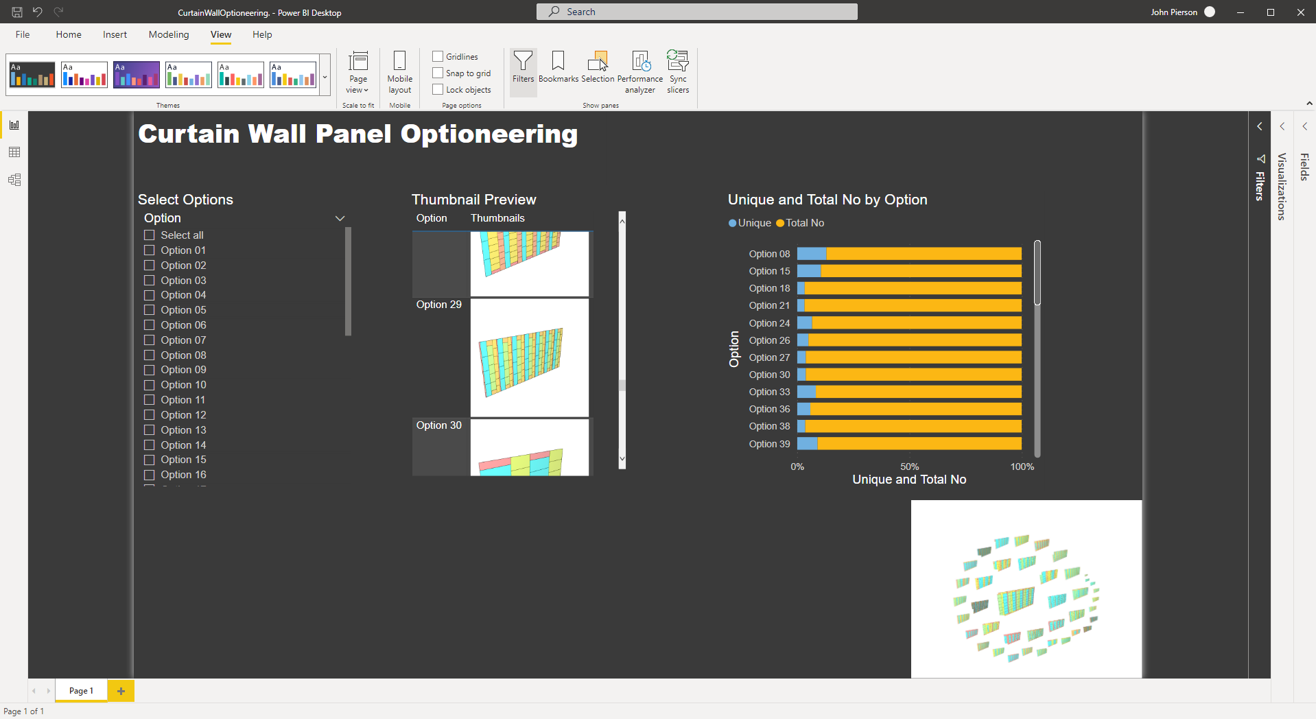
Summary
In our previous post, we demonstrated how to optioneer curtain wall panel options in Generative Design in Revit. In this post, we will take a look at a new feature available in Generative Design v22.3.10 for exploring outcomes in external programs. With this data, we are truly able to tell a story with our data. In this example, we will begin using PowerBI to visualize this data in a great way.
Exporting Outcomes from Generative Design
With Generative Design v22.3.10 and up we are now able to export outcomes. This option is available in the context menu within the “explore outcomes” dialogue.

Exporting outcomes to csv along with thumbnails
Upon export, your outcomes will be in a zip file.
Exported results
Within the zip file, we now have access to all of the thumbnails created and a CSV file with the run results.
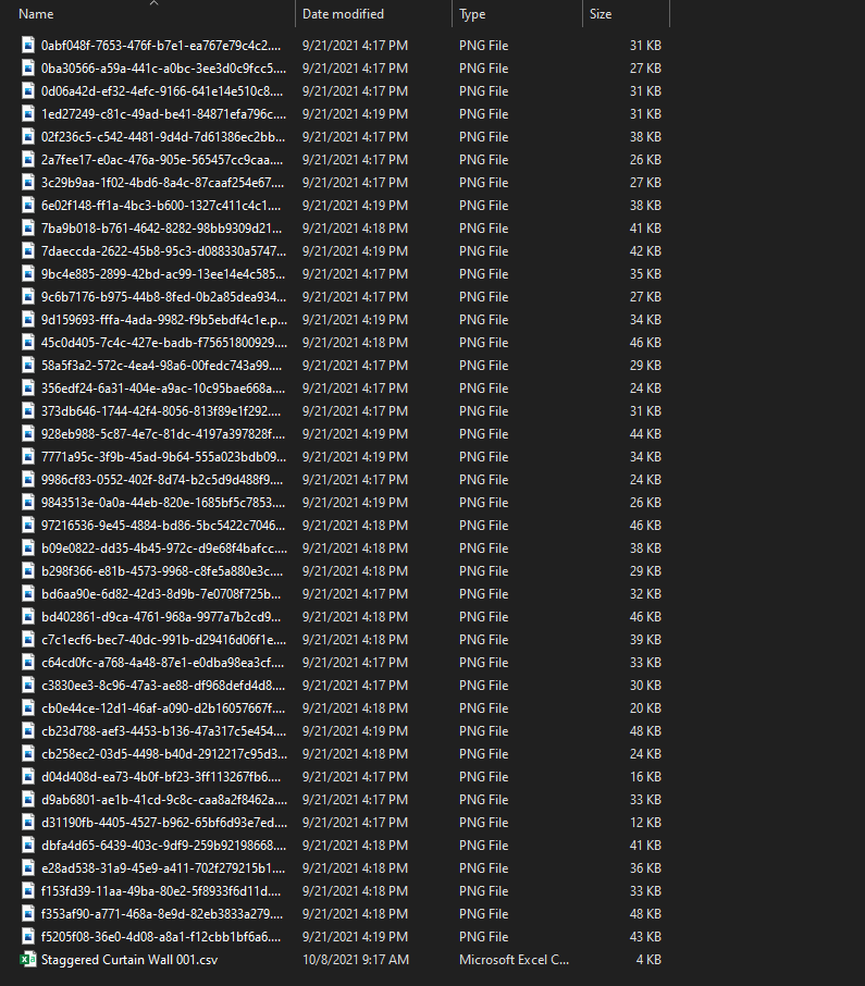
The CSV file has all of the run results within it. It also has some additional data on the first two rows, for this example, we are going to go ahead and clean these rows out.
Before we move into the data visualization portion of this workflow, we need to load our thumbnails into the file.
First, we need to host our images somewhere public. In this case, we utilized Github, which has a free account option and publicly accessible links.
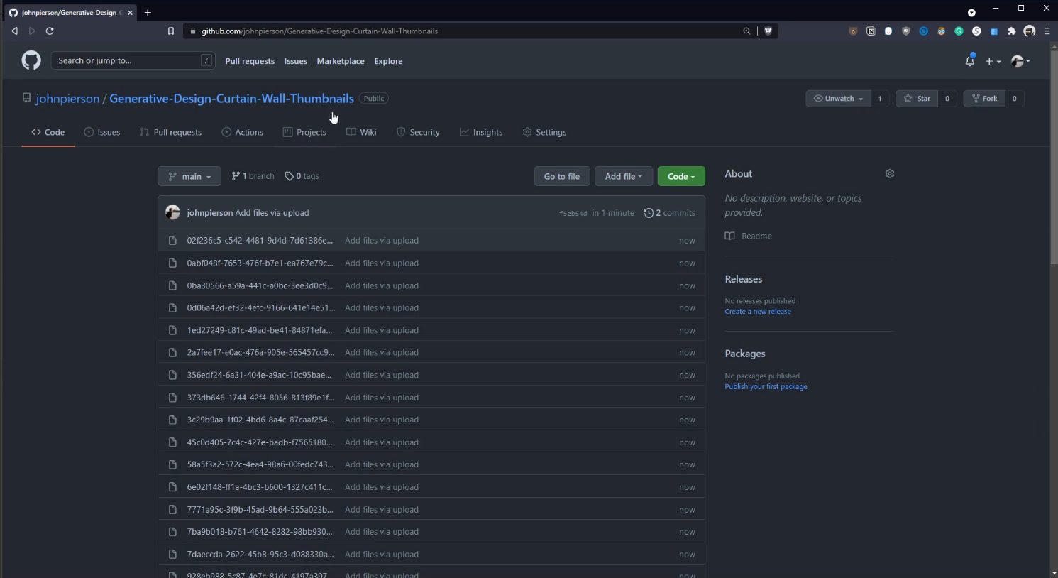
Github Upload
Second, we will link these images in Excel. There is a Dynamo graph provided in the dataset below for this.
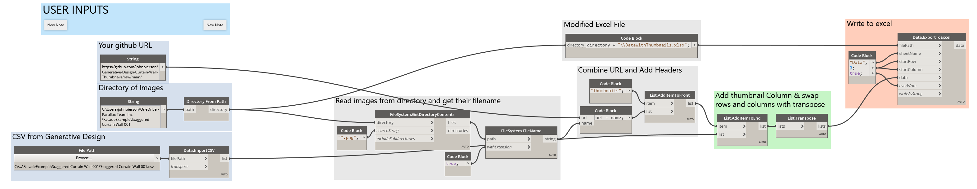
Image URL Builder Dynamo Graph
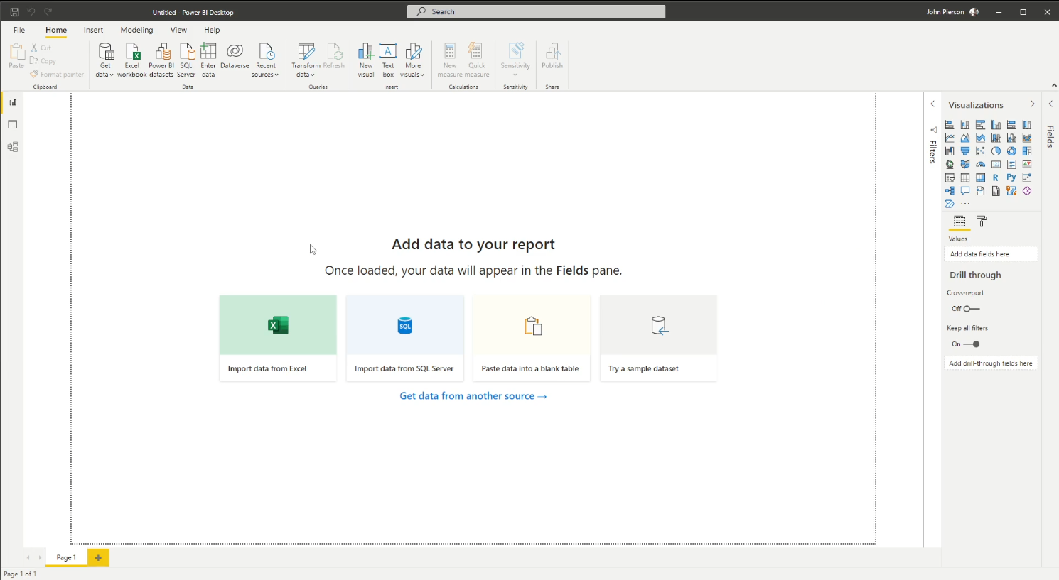
With this data fixed we can directly import this into another tool for data visualization. A popular tool for visualizing data is PowerBI from Microsoft. In this example, we are going to use the desktop version.
new PowerBI Dashboard
In PowerBI we are able to link directly to Excel.
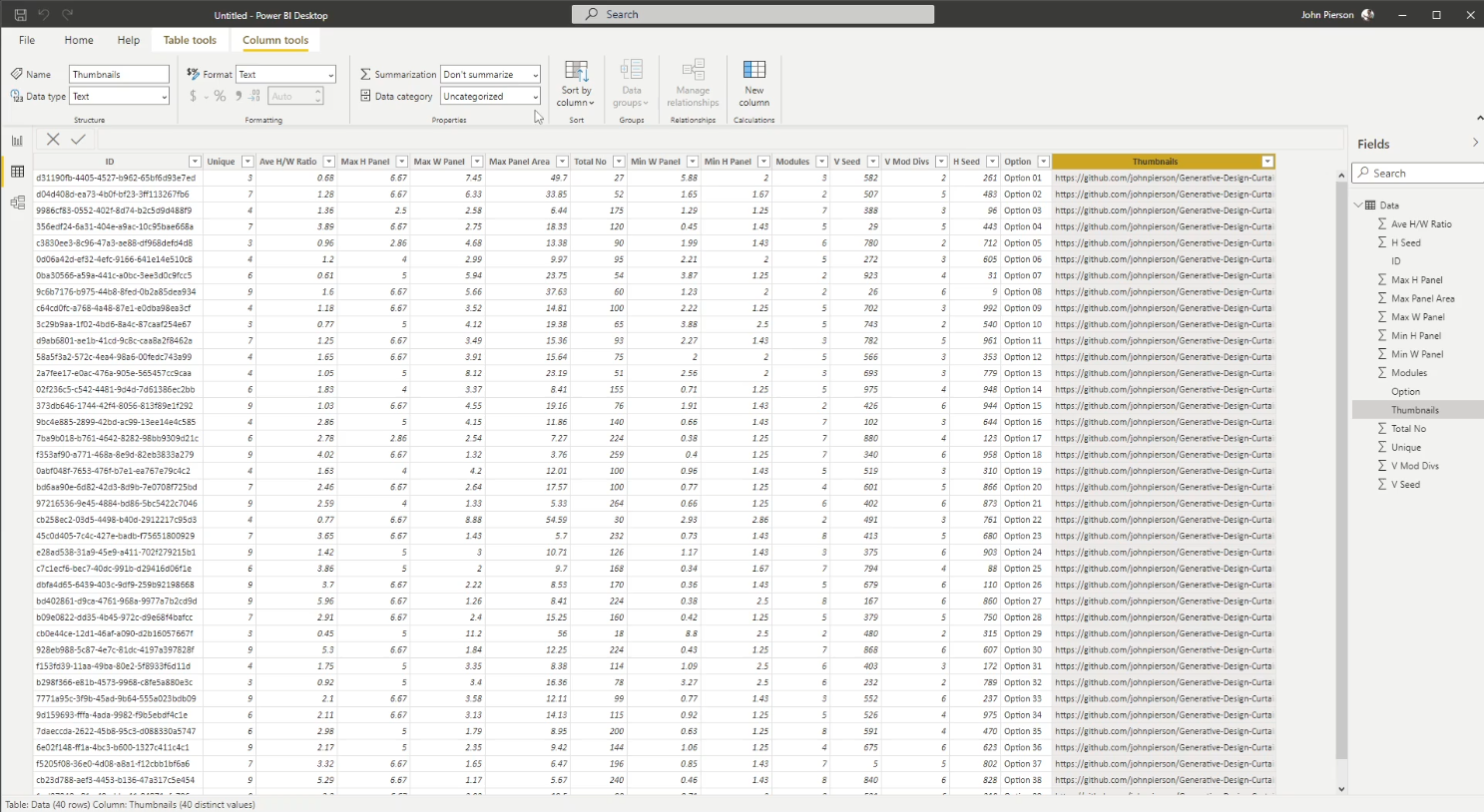
data in PowerBI
Once the data is linked, we can begin adding visualizations.
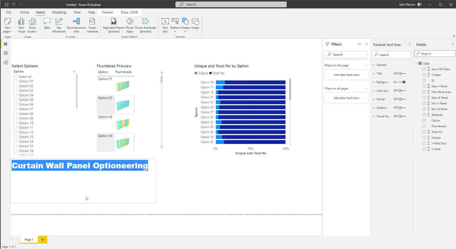
Creating the Dashboard
Sample Files Available Here: Telling a Story With Generative Design Dataset
For a full walkthrough video of the above process, see below: