Hey there, Dynamites! We’re excited to bring you another release brimming with good stuff: Dynamo Core 2.18. Below, we’ll delve into some of the greatest hits from this release, accompanied as always by plenty of practical examples and illustrations. Want more details on everything we added and fixed? Look no further than the release notes. And when you’re ready to try out Dynamo Core 2.18 for yourself, you can grab it from dynamobuilds.com. Be sure to let us know what you think on the forum!
TL:DR
Dynamo Core 2.18 introduces an enhanced set of chart nodes for data visualization within Dynamo. It adds a language picker to the Preferences panel, and provides a massively overhauled Python node editor experience with a refreshed UI and improved consistency with DesignScript. In this release, you can customize your Python editor port names and tooltips (and yes, it’s backwards compatible!), and you can add example graphs to your workspace directly from the Documentation Browser to review examples of nodes in action. You can quickly adjust your geometry scaling working range with a new button below the navigation controls, bring beautiful (and customized) colors to your graph with the overhauled color palette node, adjust library and Python node editor text size by ctrl+scrolling, and so much more!
For full details on this release, check out the release notes!
What is Dynamo and its flavors?
What is Dynamo Core?
Dynamo Core is a collection of bundled components that consist of the graphical interface, the compute engine, the scripting language DesignScript, and the out-of-the-box nodes that are not specific to another program like Revit or Civil 3d.
What is Dynamo for <INSERT HOST HERE>?
Dynamo for [Revit, Civil 3d, FormIt, Advance Steel, Alias or Robot Structural Analysis] is a collection of host-specific nodes that work with Dynamo Core and runs inside of said host.
What is Dynamo Sandbox?
Dynamo Sandbox is for package developers and other folks working with Dynamo code who want to stay up to date with the latest and greatest stuff coming out. Sandbox is Dynamo’s “Core” functionality distributed in a way that doesn’t interfere with other Dynamo installations and doesn’t require any other applications (except for a few windows components and some optional extras). You can read more about this distinction here.
So, what’s dropping with Dynamo 2.18?
Off the charts: Updated chart nodes in Dynamo Core
You can now visualize data within Dynamo using an enhanced set of chart nodes. Previously available only as a package created by former Dynamo team member Keith Alfaro (alfarok), the suite of six chart nodes is now part of Dynamo Core and accessible in the Display > Charts library:
- Bar Chart
- Heat Series Plot
- Index-Value Line Plot
- Pie Chart
- Scatter Plot
- XY Line Plot
In addition to making these charts out-of-the-box, we’ve added several improvements to level up your data visualization endeavors. Let’s take a look.
- [ 1 ] Each chart node has a
unique icon, allowing you to distinguish them at a glance from the library or in-canvas search. - [ 2 ] As soon as you place a chart node, you’ll see a
beautiful default visualizationwithout having to plug in any inputs. This gives you a better understanding of the chart right off the bat, helping you pick the right chart for your project. - [ 3 ] New
node descriptions and port tooltipsguide you through the chart creation process with descriptive text and input/output data types. - [ 4 ] Define
your own set of colors, or use thedefault colorsby leaving the colors port empty. - [ 5 ] Hover over a chart to see
more granular informationabout your data. - [ 6 ] To
enlarge a chart node, click and drag the triangle icon in the bottom right corner. - [ 7 ] To learn more about each node, select the node and press F1, or right click on the node and select Help. In the Documentation Browser, you’ll find
more detailed descriptionsof each node and its inputs. You can also look at anexample filefeaturing the node orplace the example in your workspacefor exploration, inspiration, or troubleshooting. - [ 8 ]
Export the chart in PNG formatby right clicking on the node and selecting Export Chart as Image.
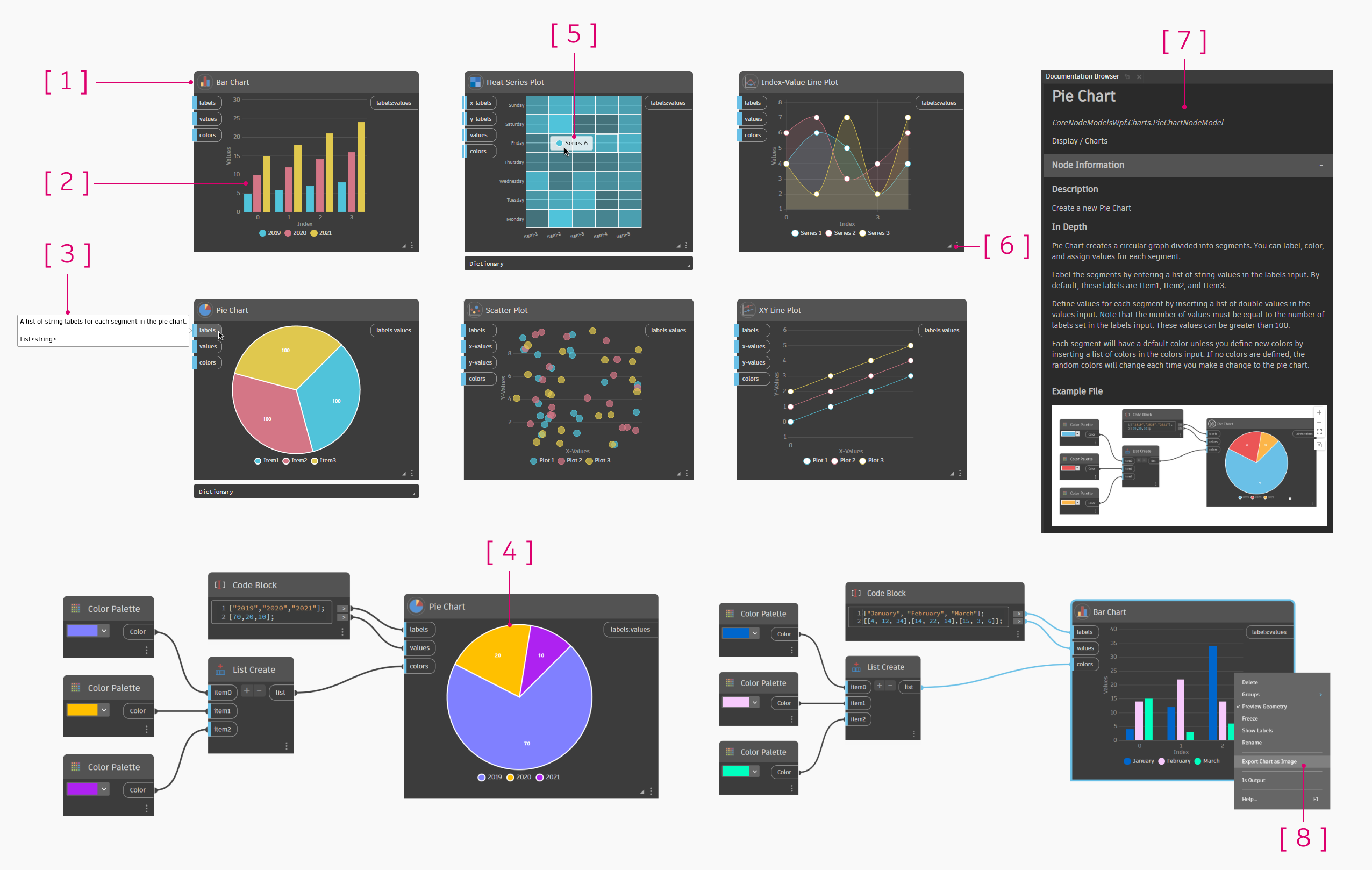
With these charts, you can visualize data inside Dynamo without having to use separate tools. Export your chart images for use in presentations to illustrate model data in a friendly format. Give these charts a try, and let us know what other kinds of charts you’d like to see in Dynamo!

Showcase of chart node animations!
Note: Charts do not have an export port on them because this would slow down the performance of every graph, regardless of whether it uses a chart node.
Do you speak Dynamo? Language picker added
Dynamo is a global phenomenon, so it only makes sense to allow more users to experience Dynamo in their preferred language! We’re also excited to bring this to those of you who prefer to use your own native language, but prepare content in another language for sharing with your colleagues. In this release, you’re now able to change language settings in Preferences > General. After you select a new language, the change will take effect once you relaunch Dynamo. The following languages are available:
- English
- Czech
- German
- Spanish
- French
- Italian
- Japanese
- Korean
- Polish
- Portuguese
- Brazilian
- Russian
- Chinese Simplified
- Chinese Traditional
Switching languages in the Preferences panel is as easy as un, deux, trois!
Getting with the program — enhanced Python code editor
Programmers, rejoice! We’ve powered up the Python Script code editor with several time-saving improvements. We are limited to what the underlying component of AvalonEdit offers to customize, but we think these all bring huge value to your Python workflows! #didntGoSoFarAsToEditAvalonEditSourceCode
First up, we’ve made several UI updates to help you interact seamlessly with the editor window:
- [ 1 ] A
restyled editor windowaligns nicely with Dynamo’s refreshed visual style. - [ 2 ] The save, revert, engine selector drop-down, script conversion, and help icons have a
new home at the top of the window. Each icon also has a new tooltip. - [ 3 ] With the new zoom in/out buttons, you can
adjust the text size to your preference. Alternatively, hold CTRL and scroll with your mouse to zoom in and out.- You can also change the zoom level in Preferences > Visual Settings > Zoom Scaling > Python Editor. As you change the zoom scale in the editor, Dynamo will update the setting in Preferences as well, and vice versa.
- [ 4 ] Keep things organized by
folding your codewith the tab key. Click the boxes to collapse and expand sections of code. Currently folding is temporary and does not persist through sessions but should do so in a future release. - [ 5 ] The new
Save and Runbutton in the bottom right replaces the old Run button. - [ 6 ] Click the help icon to access
refreshed help documentationin the Documentation Browser. - [ 7 ] If you attempt to exit while there are unsaved changes in the editor, a
notificationwill alert you, helping you avoid losing work. By the way, you can exit the editor by pressing Esc or the close button in the top right of the window.

We’ve also aligned color coding for reserved keywords between the Python editor and DesignScript—a consistency win!

Take a look at this animated GIF of the updated code editor in action, then give it a try in the latest release.

Customize your Python ports
As another perk for Python programmers, we’ve added the ability for you to edit Python Script node port names and descriptions/tooltips. Right click a port in the Python Script node and select Edit Port Properties. You can then enter a port name and a description, which gets surfaced as the port’s hover tooltip.
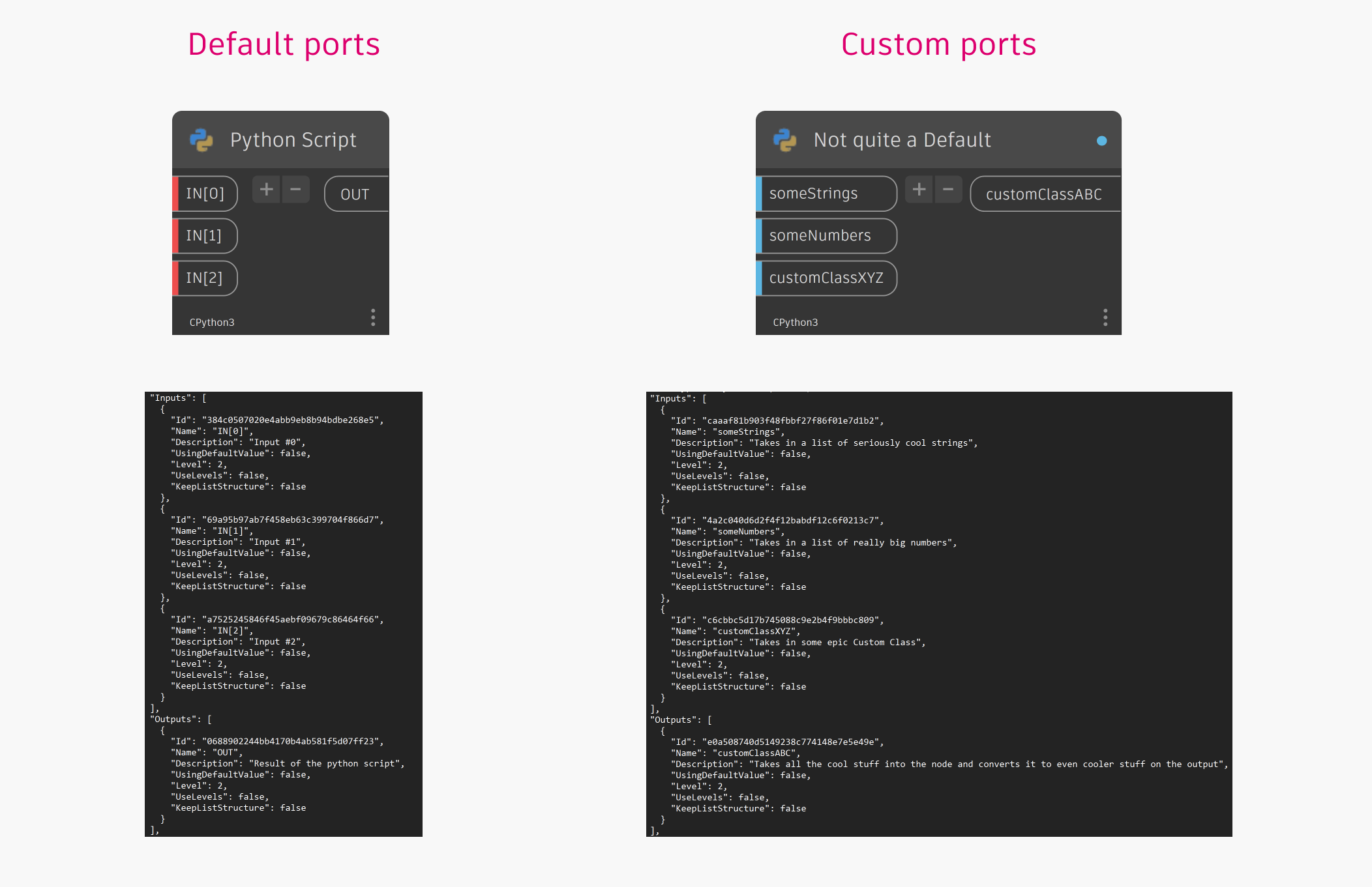
These values will now serialize (save) back into the .DYN file and are fully backwards compatible. So while you can’t set them without manually editing a .DYN in the past, they can be read.

Backwards compatible custom Python Editor ports

Customizing Python port name and tooltip
New Python libraries
Six new Python libraries are available out-of-the-box! There’s no more need to install them separately, and you can build packages containing Python that use these libraries.
The libraries themselves unlock a bunch of things:
- Numpy: Powerful mathematical library working with n-dimensional arrays and matrices. Used a lot with machine learning.
- Scipy: Powerful scientific computing library for algorithms that deal with optimization, integration, interpolation, etc.
- Pandas: Powerful data analysis and manipulation tool. Used a lot with machine learning.
- PIL (Pillow): A python imaging library, allowing users to do things like rotate, change size, etc.
- Openpyxl: A python library to read/write Excel files
- Matplotlib: Data visualization library that allows for static, animated and interactive visualizations.

New Python libraries
Insert example files via Documentation Browser
To round out the suite of improvements we made to the Documentation Browser in the previous release, we’ve now added the ability to insert an example graph into the workspace. Adding graphs to an open workspace through the File > Insert menu has been possible since Dynamo Core 2.17, but now you can add examples directly from the Documentation Browser. Simply open node documentation by selecting a node and pressing F1, or right clicking and selecting Help. If the node has an example file, you can click the new icon [ 1 ] under the navigation icons to place the example in the workspace.

The graph will appear below any other content you may already have in the workspace inside an appropriately named group, and the workspace will be automatically zoomed to the newly placed example. To avoid any potential conflicts with existing content, run mode is changed to Manual, if it’s not already. Once the example is placed, you can investigate the node’s inputs and output to help you use it in your own graph.

Placing an example file from the documentation browser
Scaling up (or down) with quick workspace geometry scaling settings
Looking for a quick way to change your workspace geometry scaling? Look no further than a new button [ 1 ] added to the workspace, right below the navigation controls in the top right corner. With this setting, you can choose to model in one of the following options:
- Small: Values between 0.000,001 and 100 units.
- Medium (default): Values between 0.0001 and 10,000 units.
- Large: Values between 0.01 and 1,000,000 units.
- Extra large: Values between 1 to 100,000,000 units.
You can select a default scale for all new Dynamo sessions in Preferences > General > Default Geometry Scaling, but the workspace control is independent, so you can quickly swap between working ranges in your current graph without affecting your default selection.

Adjusting geometry scaling settings within the workspace
Smaller buckets of work
Control library size
Node library looking too big, or perhaps too small? It’s in your hands now. To resize the library, hold the CTRL key while scrolling with your mouse wheel. You can also edit this setting in Preferences > Visual Settings > Zoom Scaling > Library.

Quickly and easily resizing the library
Color me impressed: Updated color palette node
The Color Palette node has been restyled to align with the Dynamo visual refresh. Choose from the menu of default colors, or define your own custom color using the RGBA sliders. If you’ve added any custom group styles in the Preferences > Visual Settings > Group Styles menu, you’ll also find those styles in the Color Palette node! This makes it easier than ever to maintain consistency with company brand colors, or any other established color scheme, in your graph. Use the Color Palette node in conjunction with the suite of new chart nodes for beautiful results!
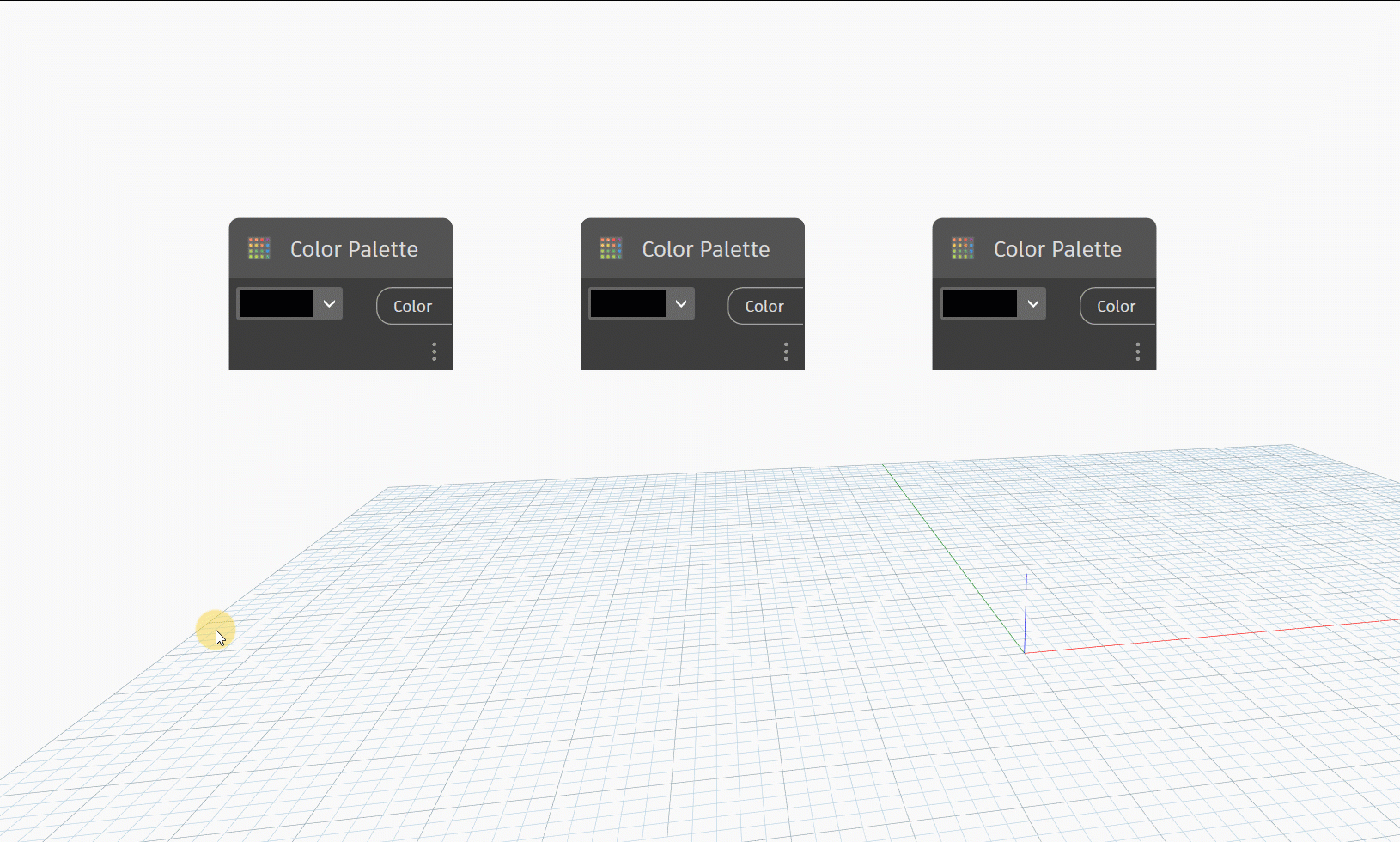
The Color Palette node allows you to pick from a list of default colors, select a custom color you’ve defined in group settings, or create a new custom color.
Make your extensions stick around
Do you have a set of favorite extensions panels that you like to keep open in your Dynamo sessions? Wish they’d stick around, so you didn’t have to reopen them every time you launch Dynamo? Now you can choose to do just that. In Preferences > Features > Extensions, you can use the toggle to define whether you want Dynamo to remember open extensions at the start of your next session, or if you’d prefer to relaunch with extensions closed (this is the default setting).
Note: Not every extension is captured here, as some don’t make sense to be remembered! For example, the Workspace References extension is contextual to a graph and already automatically pops up when you are missing packages.

The toggle is on, so select open extensions panels will remain open when you relaunch Dynamo.
Node category tooltips in the Library
If you (or your favorite Dynamo newbie) have ever wondered what those plus, lighting bolt, and question mark icons are in the node library, we have good news for you. We’ve added tooltips for each node category to explain what nodes in each category do:
- [ 1 ] Creation (plus): Nodes that create data. These nodes create or construct geometry, such as a circle, from scratch.
- [ 2 ] Action (lightning bolt): Nodes that execute an action. These nodes perform an action on an object, such as scaling a circle.
- [ 3 ] Query (question mark): Nodes that query data. These nodes return a property of an object that already exists, such as the radius of a circle.

Highlights you can see
In previous versions, the highlighter color in a preview bubble or Watch node was too similar to the content, making it illegible. Now, we’ve improved the highlighter color so you can continue to read the highlighted content with ease.

On the left, highlight color in version 2.17. On the right, improved and visible highlight color in version 2.18!
Dynamo Service Mode for CLI
Dynamo Service Mode for CLI (command-line interface) was introduced in 2.18 to enable Dynamo Player to leverage it. However, it’s currently not exposed or designed for general use and may change in future versions, so at this time we don’t recommend you use it.
Linter
In this release, we’ve added the Linter, which is currently only used for the Generative Design extension to notify uses about graph issues and requirements. This is not yet designed for general use, so experiment with it only at your own discretion at this point. We’ll keep you posted on future updates.
Bug fixes
- We resolved a painful bug in our geometry kernel where it was failing to clear floating point exceptions not being cleared from a previous geometry function call, resulting in a large swathe of Geometry nodes hitting a warning state. If you’ve seen a warning about failure to construct things like Polygons, this is the reason! What made it particularly tricky was these errors only happened after an initial run and only in certain host applications such as Revit, so simple pass/fail tests never caught them. Whoops #lessonsLearnt
- We fixed a bug with the String from Object node where an incorrect number was being shown in the preview bubble. Now, the node honors number format precision settings from the Preferences panel.
- We fixed a crash with the List.AllIndicesOf node, where the node stopped working if the list being checked contained a null at the first index. Now, the node should work properly whether or not the list contains nulls.
- Previously, when switching from background 3D preview to graph view while in Orbit mode, the workspace switched to Pan mode and the cursor turned into a hand icon. Now, you’ll exit Pan mode when switching views, and the cursor will change to an arrow.
- We fixed a bug with the Data.OpenXMLImport node, where it would sometimes bring in data, and sometimes bring in formulas. Now, the node brings in only data.
- We improved group color styles to ensure that the text remains legible, no matter what color you choose. Previously, dark group styles were hard to read or illegible due to text remaining dark as well. Now, the group style auto-adjusts the text color to ensure that contrast between the group color and title/description remains larger than 4.5.

The text color for group name and description automatically adjusts so that text remains legible no matter what group color you choose.
Epic stuff! So where can I grab Dynamo 2.18?
Dynamo 2.18 will be made available in our host integrations at a future date and can be explored right now through the dynamobuilds.com website or the Github build page – available in the Sandbox version of Dynamo.
If you’re curious, you can also read our Release Notes
For more information on other minor features, bug fixes, and known issues in Dynamo 2.18, go check out our release notes!
A big shout-out to everyone who contributed to the release and the entire Dynamo community for continuing to support our work. If you want to stay up to date on what we’re working on and what’s coming next, take a look at the Dynamo Roadmap, where you can rate features and add comments, plus submit your own ideas!
The Dynamo Team