Kia ora world of Dynamo,
Today marks the first Dynamo release of 2022, bucking the previous trend of including more and more features in lieu of deep diving into bug fixing! This release seeks to hone the rough edges and safeguard edge conditions to ensure that Dynamo 2.14 is smoother, swifter and more complete.
TL:DR
We introduced zoom states that surface node states graphically; added in extended node help for each Dynamo core node, with in-depth descriptions and example images; added new nodes (String.GetNumber) and improved existing nodes (i.e., Learn More link to Point.ByCoordinates(X,Y), and Lacing and List@Level support to variable input logic nodes); added in Group Styles to expand options and build in consistency; worked through modernizing residual Visual Refresh elements and a whole bunch more! We also had a giant focus on bugs, with 88 fixed in this release. As usual, there is a whole bunch more, so please do check out the release notes!
What is Dynamo and its flavours?
What is Dynamo Core?
Dynamo Core is a collection of bundled components that consist of the graphical interface, the compute engine, the scripting language DesignScript and the out-of-the-box nodes that are not specific to another program like Revit or Civil 3d.
What is Dynamo for <INSERT HOST HERE>?
Dynamo for [Revit, Civil 3d, FormIt, Advance Steel, Alias or Robot Structural Analysis] is a collection of host specific nodes that work with Dynamo Core and runs inside of said host.
What is Dynamo Sandbox?
Dynamo Sandbox is for package developers and other folks working with Dynamo code who want to stay up to date with the latest and greatest stuff coming out. Sandbox is Dynamo’s “Core” functionality distributed in a way that doesn’t interfere with other Dynamo installations and doesn’t require any other applications (except for a few windows components and some optional extras). You can read more about this distinction here.
So, what’s dropping with Dynamo 2.14?
Node Zoom States
With the Dynamo Visual Refresh and Modernization work landing in Dynamo 2.13, the ability to see node states (Such as Error, Warning or Preview) when zoomed out lost a little bit of punch… so we made it punchier! #winning. Introducing Zoom States into Dynamo that trigger when you zoom past a certain threshold, showing all nodes that are in a series of chosen states to now show graphical glyphs and color overlays that represent these states:
- Dominant set:
Error>Warning>Information| Shows only the most dominant state in this list, with the dominant state also dictating the color overlay. - Secondary set:
Frozen>Preview Off| Shows either or both of these states in this list, with a fallback color overlay if no dominant state is represented.
The dominant set dictates the color overlay if one of these states is in play: red for error, yellow for warning and blue for information. If there are no dominant states, the overlay falls to the second set, with frozen taking precedence over preview off. So, quite the set of complex relationships, but it does do the job of showing you what you need to see in an instant! Huzzah.
- [ 1 ] Standard Node Behavior at Zoom Threshold
- [ 2 ] Node in a Preview Off Zoom State
- [ 3 ] Node in a Frozen Zoom State
- [ 4 ] Node in the Frozen and Preview Off Zoom States
- [ 5 ] How to create infinity in a Code Block just for fun! To infinity and beyond!
- [ 6 ] Node in a Warning State
- [ 7 ] Node in the Warning and Preview Off Zoom States
- [ 8 ] Node in the Warning and Frozen Zoom States
- [ 9 ] Node in the Warning, Frozen and Preview Off Zoom States
- [ 10 ] Node in an Error State
- [ 11 ] Node in the Error and Preview Off Zoom States
- [ 12 ] Node in the Error and Frozen Zoom States
- [ 13 ] Node in the Error, Frozen and Preview Off Zoom States

Dynamo Zoom States
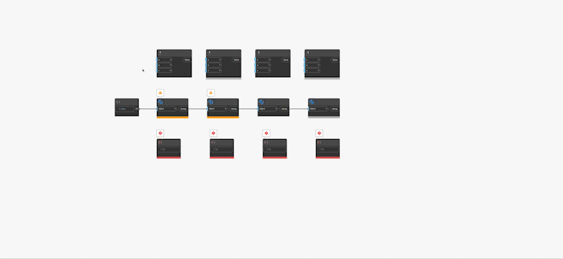
Zoom States in Action
A big shout-out to Archilizer for helping us out on this epic feature! Expect more cool things to come down the pipes from Deyan and the team in Dynamo 2.15.
Extended Node Help
We have a pretty awesome resource, the Dynamo Dictionary, that expresses extended help for (almost) every node in the form of an in-depth description, sample image and sample file. But it had a little problem: It wasn’t known to many of the people who needed it the most – beginners starting on their Dynamo journey. To give them a helping hand in a place that is, well, more helpful, we have now introduced extended node help documentation out of the box in Dynamo! For almost all Dynamo Core nodes, you can now access the nodal context menu to get extended help via the Help... menu item, with plans to round out the Core node set, and later introduce our host integration nodes.
Having sample documentation inside of Dynamo allows you to find the information when you need it most and see an example of how to use that node with the context it requires to function! Cool stuff.
Note that we are going to update these images to match the Visual Refresh style and also improve the extended documentation user experience, but we think that getting this content into your hands as soon as possible will bring more value than waiting for perfection. #agileMethodology #practiseWhatWePreach
- [ 1 ] Access the Context Menu via the ellipsis icon on any node
- [ 2 ] Access via the
Help...menu item in the Context Menu - [ 3 ]
In Depthinformation explains how each node works - [ 4 ]
Example Filesshow each node working in a simple example

Extended Node Help
Groups and getting Stylish
Group Styles
Now that Dynamo has awesome new Groups that collapse and do other funky things, we are introducing Group Styles that enable you to pre-set, well, group styles. In the beginning, there is only the ability to name it and predefine colors, but in the future we will be expanding these presets to include things like font size and prefixes. If you have other ideas around what other Group Style elements you want to bake in from the get go, then reach out! You can access the Group Styles from the Preferences Panel.
You’ll notice we have given you four defaults to start with: Actions, Inputs, Outputs and Review, which inherit four of the original group colors. These are static and cannot be changed to establish a degree of default consistency in the broader Dynamo ecosystem. But, should these names and color choices not tickle your fancy, then feel free to add as many styles as you wish. The world is your oyster here, you just may be scrolling for a bit if you decide to add in hundreds of styles. Rock on customization and color-representation!
Group Styles are not serialized (saved) into a Dynamo graph, but rather are serialized into your DynamoSettings.XML file (where your chosen settings are saved so Dynamo remembers) to give you control on a per-machine basis. However, if you give your graph to someone else, the color, title and description of each group will be honored.
- [ 1 ] Access via
Preferences Panel -> Visual Settings - [ 2 ] The
Group Stylesexpander lives along with other visual settings. #friendsForLife - [ 3 ] You can click the
Add Stylebutton to add a new Group Style - [ 4 ] Four predefined Group Styles:
Actionsin cyan,Inputsin pink,Outputsin orange andReviewin blue #rhymeTime - [ 5 ] When setting a Group Style, you can choose a
Colorusing the color palette where the full gamut of colors is available - [ 6 ] If you try to create a Group Style that is already in use, you’ll get a
warning iconand theSave button will then be greyed out - [ 7 ] The
Cancel buttoncancels out of the process. ‘Nuff said. - [ 8 ] You can
delete your Group Styleusing the trashcan icon. - [ 9 ] The Group Style’s
color hex codeis visible should you wish to color match easily

Group Styles
To give a style to a group, you will use the new Group Style context menu item that first surfaces the four built-in styles, then a list of your user-defined styles in order of creation. As part of this work, the previous colors settable on a group have been moved to a new sub-menu that is now consistent with the font size approach, enabling you to still set one of the base Dynamo group colors on any given group. You can also change the group name, group description and font size to your heart’s desire, and this will not affect the group styles, as they are applied only once at the point of selection.
- [ 1 ] Access to the Group Styles is via the
Node Context Menu(ellipses icon) - [ 2 ] The new
Group Stylemenu item houses all the group styles you can apply to your group - [ 3 ] The top four entries are the
default Group Styles, bound by a horizontal line break - [ 4 ] Access the
base Dynamo group colors here - [ 5 ] User-created Group Styles are available here. Long names will truncate with an ellipses

Access to Group Styles
Groups
Dynamo 2.14 also drops with a bunch of quality-of-life improvements and bug fixes to Groups. You can now Shift + Left Click to select additional groups, which was a bit of a faux pas on our part, and you can also create a group when your selection includes groups via the right click canvas menu option: Dynamo 2.13 only allows you to drag groups into groups.
We have improved the clarity of the “Add to group” context menu item to give you a little bit more information on the target, by adding in a “this” as “Add group to this group,” as it was previously confusing which group was the focus. We also marked the workspace as modified when you add or remove things from groups (which will prompt you to save if you try to exit with unsaved changes). Drag selecting under a collapsed group will also no longer collect invisible things, which admittedly, wasn’t intended nor ideal.
Overall the experience of using groups should be smoother and more sensible and behave as expected. Rock on polish passes!
Expanding and Improving the Nodal Landscape
A huge shout-out to our community node contribution of String.GetNumber from Chuong Ho, a long-time Dynamo user and author of the DynaMEP package among many! This awesome node will take a string input and pull out the numbers from it, returning them as a string. No longer do you have to do all sorts of string manipulations and truncations. Hurrah for getting from Point A to Point B faster.
There was also a funny edge case that, while technically accurate, wasn’t showcasing the “Learn More” link in the Point.ByCoordinates(X,Y) node for argument type warnings, even when the equivalent would show on the Point.ByCoordinates(X,Y,Z) node – so we added it in.
We have also added Lacing and List@Level support to variable input logic nodes (basically those with a little plus + or minus - symbol and auto-generating input ports) that now allows you to use these features rather than have to rely on the static input equivalent nodes and funky list manipulations. More power with the same real-estate? Rock on.
In some situations, our two sweep operations Surface.BySweep and Solid.BySweep would fail, stopping viable geometry from being created. So we extended their power by adding in a cutEndOff variable that should heal the geometry by default, but still enables you to turn it off if you prefer the previous behavior.
In smaller works, we also added in tooltips to the Input and Output nodes used in Custom Nodes, so they don’t feel left out, improved curve projection workflows to now treat a plane as infinite geometry and improved the topology node Edge.CurveGeometry to now return exact curve types (i.e., Line instead of Curve), all moving the needle towards a better, more well-behaved Dynamo.
- [ 1 ] New
String.GetNumber nodein action - [ 2 ]
Learn Moreadditional case added to Point.ByCoordinates(X,Y) - [ 3 ] Variable-input logic nodes empowered with
Lacing and List@Level - [ 4 ] New
cutEndOff inputon the Surface.BySweep and Solid.BySweep nodes

Node additions and improvements
Visual Refresh Fit and Finish
Dynamo 2.13 dropped the biggest visual change in Dynamo in years – the Dynamo Visual Refresh! So in Dynamo 2.14, we’ve continued this good work to build cohesion in the user interface and polish the overall look and feel of Dynamo by restyling yet more elements such as dialog boxes, cleaning up interaction paradigms such as making consistent hover interactions, improving existing feature sets and (re)introducing more.
Nodal Function State
Dynamo nodes have a state called Function, which means the node itself hasn’t executed yet due to a missing input or set of inputs. You can easily see this in the Preview bubble of a node in such a state because it says, well, function. Easy peasy! But, what does this state actually mean, and why are you talking about it? Well, the function state serves two primary purposes:
- Showing you that a node has not correctly executed, returning a Function
- Enabling Function Passing via nodes in a Function state
For the former, showing you that a node has not executed yet is helpful as unless you designed this situation (a la the node working in a function passing way), your graph is probably not executing how you intended, and it will help you hone in on that problem space to resolve. In previous versions of Dynamo, you could see the function state represented visually with a dimmer color palette, and now we have reintroduced the Function state on input and output ports.
- [ 1 ] Old node representation of the Function State via the
light-grey node header - [ 2 ] All nodes in a function state return the
Function output, which is consistent across all Dynamo versions - [ 3 ] Old node representation of a node’s active state via the
dark-grey node header - [ 4 ] New node representation now has vertical grey state bars on both the input and output ports of any node
that is in a Function Passing state - [ 5 ] New node representation now has a vertical grey state bar on the output port of any node that is
returning a Function output, but is not in a Function Passing state

Function State
Info Alerts
For situations where an Error was too extreme, and a Warning wasn’t entirely applicable, we have now introduced a new Node Information state that will essentially give you FYI’s (For Your Information) on a given node when you trigger a certain condition. Basically, when you need to know something, it will tell you. Cool, eh!
So far, we’ve only introduced this into a single node, the integer slider, which now tells you if you enter a number outside the bounds of the int64 range (i.e., greater than 9,223,372,036,854,775,807 or lower than -9,223,372,036,854,775,808), but we have plans to express this across all sensible nodes in time. If you have any suggestions on this front, please get in touch. You can also dismiss the node info alert in a similar fashion to the dismissal of warnings.
For the Package Authors out there, you too can access and use the info state in your own packages via NodeModel nodes by utilizing the Info method, with Info("message"); you can set a persistent message if you wish, or wrap this class inside of conditional statements to trigger based on how users use your node. We’re going to expand beyond this to ZeroTouch (C#) nodes and Python at a later date. We’re uber excited to see what you do with it! Imagine a world where you can inform users based on any condition you set… powerful stuff.
- [ 1 ] Node info alert shown as a
blue circlewith anicharacter - [ 2 ] To
trigger this particular alert, you need to enter a number over the maximal positive or maximal negative value in the int64 integer range - [ 3 ] We missed a bit here… this bar should be blue and will be remedied in Dynamo 2.15! #owningOurOopses
- [ 4 ] Hovering over the info alert will give you the
information message(s) - [ 5 ] You can
dismissthe info alert in the same way you can the warning alert - [ 6 ] Imagine this is how the info node status is supposed to look, and look forward to it in Dynamo 2.15
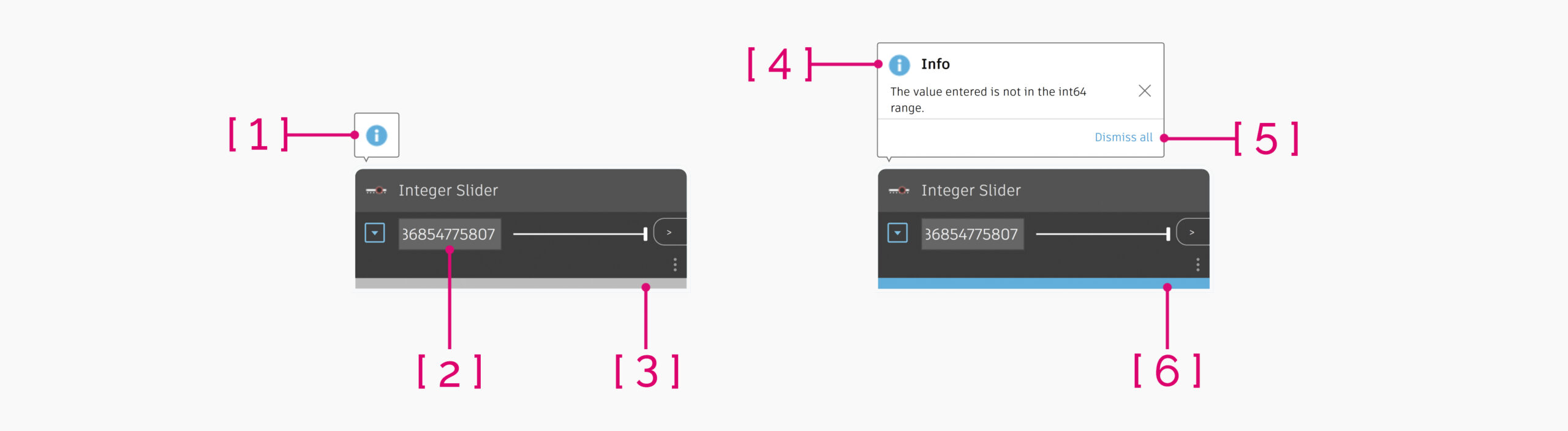
Node Information State
Quality of Life Improvements
A huge shout-out to our community feature contribution of remove nodes and notes from the current group with Alt + Click from John Pierson, a long-time Dynamo user and author of the Rhythm package and Monocle extensions! This awesome feature will enable the inversion of the “drag a node into a group” feature we added in Dynamo 2.13 to quickly allow you to remove nodes or notes from a parent group. Waaaahoooo for time saving shortcuts and double-waaaahoooo for community contributions!
Hotkey to remove Nodes and Notes from Groups
We have also added in the ability to unpin a note from a node into the node context menu, adding a new way to unpin beyond clicking the pin icon of yester-release, and added the unpin note from node action to the undo/redo stack so that if you inadvertently do something, you can quickly revert back to your intended state. Fun fun.
Smaller Buckets of Work
Beyond the awesome improvements above, we have also done a bunch of other work around improving the rendering of coincident line, point and mesh geometries to improve the z-fighting issue, resulting in less rendering noise and clearer images, made the mouse-manipulator thread-safe resulting in less crashes, added the ability dynamically load new Python engines, and fixed a long-standing regression by again allowing the + button in the Add-ons section to display persistently, enabling the import of new files when you didn’t previously have a package installed.
So, what salient bugs out of the 88 are being fixed?
- Fixed a performance issue with the Node Status bar (Error, Warning or Info), which caused a delay in propagation in all out-of-process host integrations and a delay in in-process ones. Simply put, this is now faster and more optimized.
- In DesignScript with Boolean conversion, null values are now converted to False, and arrays of null are now converted to arrays of False values.
Freezevia the nodal context-menu can now be enabled when multiple nodes are selected, freezing the triggering node and all nodes downstream.- Another big shout-out to Chuong Ho for his second awesome contribution that centers pop-up dialogs to always show at the center of a parent dialog – e.g., the package manager dialogs around package download. On fire Chuong!
- Global variables defined in DesignScript now have globally unique names under the hood, enabling their reuse in other Code Blocks as well as nested language blocks (i.e.,
AssociativeorImperative). Nested language blocks (i.e.,AssociativeorImperative) in DesignScript should also now crash less. List.Containsnode now gives consistent results with the Equals node for number equality – Refer to this forum post for context.- Code Block nodes now correctly display compile-time and runtime warnings as multiple unique warnings.
- Copy and pasting a code block node with warnings will now correctly show those warnings on the newly copied node.
- Obsolete node warnings are again displaying as expected.
- Node2Code warnings on a resulting code block will no longer cause a crash.
You’ve sold me, so where can I grab Dynamo 2.14?
Dynamo 2.14 will be made available in our host integrations at a future date and can be explored right now through the dynamobuilds.com website or the Github build page – available in the Sandbox version of Dynamo.
If you’re curious, you can also read our Release Notes
In order to keep a semblance of propriety to this blog post, we’ve skipped a few things! For more information on other minor features, bug fixes and known issues in Dynamo 2.14, go check out our release notes: This particular set contains a bunch more bug fixes as well as some minor feature enhancements.
A big shout-out to everyone who contributed to the release and the entire Dynamo community for continuing to support our work. As always, please let us know if you have any feedback or suggestions!
The Dynamo Team