Last summer, I detailed an algorithm with Dynamo to solve for a maximally packed office seating chart given social distancing requirements. It was an example of single-objective optimization because the goal was to maximize just one metric—the percentage of seats occupied—with a single rule: an occupied seat must be at least a fixed distance from any other occupied seat. With that problem statement, all the knowns can be known, so the result is directly calculable. We found the right answer by running a Dynamo script a single time, and there wasn’t much controversy about the result save for obscure edge cases. But what if you have other issues to consider, too, like minimizing unnecessary physical interactions? What if you want the healthiest seating chart, not just the densest legally-acceptable seating chart?
In part 2 of 3 in the series, we’ll use Dynamo for multi-objective optimization, and we’ll stay on theme, adapting the algorithm covered in part 1 to include considerations for traffic, congestion, and density. We’ll use the Space Analysis package developed by an Autodesk Research team to help analyze results, and we’ll leave behind the notions of finding “the right answer” since our multiple objectives will compete with each other. Instead of a single answer, we’ll look for better-performing sets of options. The Dynamo script will be the engine that converts sets of inputs to proposed results, and we’ll use the Generative Design in Revit feature do all the bookkeeping and data visualization to create and analyze studies.
Generative Design in Revit
Let’s get straight to the point: here’s the Dynamo script! COVID occupancy for Revit GD.dyn
Using This Script
You’ll need the latest version of Revit, at least 2021.1.2, and to use it in Revit Generative Design, your Autodesk subscription will have to support that feature. If not, you can still use the script by running Generative Design from Dynamo.
Download the script and open it in Dynamo. Download any dependencies it warns you that you’re missing. Run it to make sure it works. Inputs are well-labeled in pink-colored groups, so make sure those are set. If you see results, proceed to export the graph to Generative Design in the menu at the top and follow the prompts. If not, track down where you find that errors begin; more than likely you missed filling in an input.
If you need to troubleshoot, check out these potential issues:
- If your Revit is not in English, update the name of a single parameter that’s set one time to whatever it is for you. (I’m so sorry there wasn’t a better way around this one thing!) At the beginning of the light blue group called “[Revit] Find wall boundary lines”, a code block says
"Base Constraint". Update this to be whatever the parameter for the base constraint of a wall is in your language. - Since the Space Analysis package contains dlls, you may need to restart Dynamo to load those nodes properly.
Make sure the limits of the two sliders called “design inputs” in pink groups near the top in the center have ranges that are meaningful to your graph. The input called “Maximum Congestion” doesn’t have units, so it’s hard for me to give guidance other than to pick values close to what’s already set. The metric called “Minimum Separation” will have to be in units meaningful to your project. Since I’m an American, it’s set to 6 for the local public health guidance of 6 decimal feet. The slider’s range will need to be updated for metric users to include, say, 1500 millimeters.
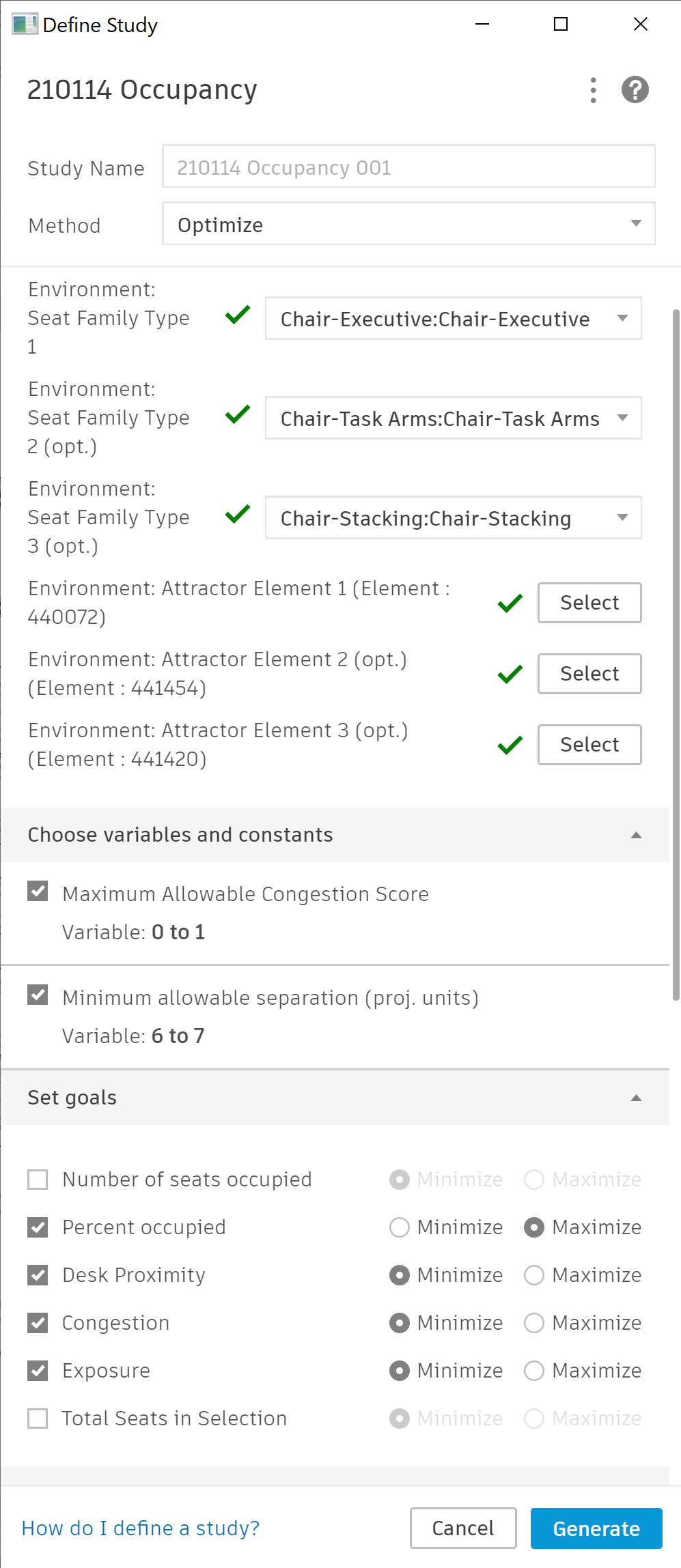
Create a Study
| Make sure Dynamo is closed, and in Revit, choose the option to “Create a Study” in the Manage Tab and the Generative Design area. If you’ve successfully exported the script from Dynamo, this is where you’ll be able to choose that export as your template. Choose “Generate” at the bottom of the window to start calculating. The script will run several times locally on your machine. In the background, Revit Generative Design is running your graph with multiple sets of inputs and caching the results. In the “Explore Outcomes” window that will appear on its own, you’ll start to see the results populate as their available. The Dynamo script is enormous, but for reasonable floor plate sizes, and a small number of attractors set, you’ll should see a few dozen results per minute. Two example setups are shown at right that use different criteria. |  |
 |
Explore Outcomes
One of the biggest challenges with multi-objective optimization is understanding the consequences of what just happened, and the “Explore Outcomes” feature of Revit Generative Design is designed to help by providing lots of options. A parallel coordinates chart shows many different inputs and outputs to give a sense for how their values relate. Each blue line represents an iteration of the script with particular input and output values. This is a useful view to understand patterns. Use “filters” by specifying regions of some parameters to restrict results. Below, I set filters for higher % occupation (so, more workers fit into the seating chart) and lower exposure scores. From my random sample of 40 options, only 6 remain, and I might use further criteria to narrow the search space further.

My favorite feature is the scatterplot. You can’t compare as many dimensions of data at the same time as you do with the parallel coordinates plot, but you can compare up to 4 using the x and y axes, color, and dot size. Play with some different choices here and look for patterns. In the example below, with just 40 random sets of inputs, clear patterns emerge. Each dot represents a particular solution.
- The x axis shows how many seats are occupied, so the farther right the dot, the more people fit in the seating chart.
- The y axis shows the exposure score, so the lower the dot, the presumably safer the average occupant is.
- The color of the dot represents the congestion score, so the bluer the dot, the higher the expected congestion score.

This kind of plot is so cool because you can see the “Pareto Frontier”—the curve defining all best-possible solutions—emerge from a set of solutions. Consider that the “perfect” solution to the COVID office occupancy problem would be a seating chart where the most people can fit with the least interaction between them, which would correspond to a dot on the bottom right part in the plot. But perfect isn’t possible because the two objectives fight each other. Instead, a curve on this plot defines all the solutions that come closest to perfect, and you can just start to see it sag below the main sequence of results. With further optimization and iteration, all better-performing options will cluster along that curve. As a designer, you can then choose among those best-performing options according to other criteria. For example, if you must have more seats occupied, move to the right along the Pareto Frontier. Or maybe just pick the better-performing result that means you don’t have to move your own desk…
A second study using the Optimization method works harder to find better results. The same Pareto Frontier can be seen, and more of the results lie closer to that optimum curve.

When you find a solution you’d like to keep, click the “Create Revit Elements” button when a solution is selected, and you’ll have options to push information back to the Revit model. Workflow considerations for how to do this effectively were covered in part 1 of the blog post series, and considerations for how to work with this part of the script will be covered in part 3.
The Algorithm
| Begin with a Revit model where the active view is a floor plan. The script will ask a user to specify the list of family types that correspond to seats that should be considered as part of the study and which Revit elements will act as “attractors” for foot traffic from seat locations. All elements not in the active view are excluded, so you won’t update another floor plan by accident. |  |
| From the active view, gather information about pathways and obstacles to movement in the form of simple lines/curves. Plenty of heuristics are involved here to create a simplified floor plan in Dynamo, including how to extract centerlines for different types of wall and how to “cut out” doors from those walls. If your floor plate has balconies, elevation differences, partitions, or anything else fancy, this is where you’ll want to tweak the logic so that the simplified floor plan has lines that accurately represent obstacles to movement. The fewer the lines the better to save significant computation time later. |  |
| Find the geometry for furniture elements that exist in the active view, and separate furniture involved in the seating study from all other furniture. Bounding boxes give a fast and accurate approximation of geometry without having to overly complicate calculations. All seats (blue circles) are candidates to be occupied. All other furniture (gray) represents barriers to movement, but not barriers to airflow, so we’ll treat them differently for different spatial studies later. |  |
| Analyze the spatial implications of the existing fully occupied floor plan. The Space Analysis package provides a way to quickly calculate the most direct routes between each seat and every “attractor,” which I’ve set to be doors to leave this open office environment. The paths can be visualized (orange), but mostly we’ll be interested in where common paths tend to bunch up on the floor plate.
The spatial resolution for the space lattice is set to the average width of a seat to make it independent from unit issues like millimeters vs decimal feet. I’ve moved furniture enough to know that chairs generally fit through most doors, and it turns out that works out computationally too. |
 |
| The Space Analysis package can be used to create a “space lattice” for the initial condition to represent the aggregate locations for foot traffic as visualized here with a heatmap. As colored, purple areas represent low foot traffic and green areas represent high traffic.
Seat locations are already known, so we can derive an expected “exposure score” per seat that represents how frequently someone sitting there would be exposed to passers-by. In the diagram, seats (blue circles) are colored to represent the range of values of exposure. In the image, darker blue seats represent a higher risk to occupants than lighter blue seats. |
 |
| At this point Revit Generative Design specifies the values for two critical design inputs: the maximum allowable seat exposure score and the minimum allowable distance between two occupied seats. Seats that have too high an exposure score from the initial conditions are eliminated, then the remaining seats are determined to be either occupied or left vacant according to the algorithm from part 1. As shown in the diagram, active seats are blue with “exclusion zones” drawn around them as a dotted line and seats that shouldn’t be occupied are colored red.
Look closely at clusters of red seats. Before you say “hey, wait, some of those could have been occupied,” check the exposure scores for those seats in the image above; for this set of inputs, those seats had too high an exposure score, and they were eliminated. |
 |
| Three spatial metrics are calculated in the script using the Space Analysis package, each producing a heatmap to visualize higher and lower risk areas and a single number that attempts to quantify the performance of the full design. Heatmap visualizations are normalized so that you can always see variation even if it’s tiny, which also means that you shouldn’t take strong colors to mean “bad”.
This first heat map shows aggregated traffic for the designed condition, for an overall effect that models “congestion.”
|
 |
| “Exposure” can be modeled per seat as kind of a metric of the previous metric. Yellow spots here represent active seating areas with greater exposure to the traffic shown in green above.
This and the following metric each employ a technique called a view cone to restrict considerations for any particular seat to the region immediately in front of and to the sides of a person sitting at that seat. This requires knowing the orientation for each seat, which is derived through heuristics assuming that seats tend to face the nearest non-chair-like piece of furniture, like a desk or a table. |
 |
| Finally, relative “proximity” is a metric to score the relative clumpiness or diffuseness of the seating chart. Red areas represent higher concentrations of occupied seats while those seated in greener areas will have a little more breathing space. |  |
Thanks!
The Dynamo script described here is provided to you with the hopes that you’ll use it in full or in part for this or any related generative design problems in the Revit environment. It represents a monumental collaboration between many people over the course this and many previous projects. The Dynamo graph is a solid candidate for the most complex graph I’ve ever built. It couldn’t have happened without the strong head start from Autodesk Research’s work with Space Analysis. Thank you Rhys Goldstein, Hali Larsen, Lorenzo Villaggi, and Kean Walmsley. And for the world’s kindest help line on the Revit Generative Design team, Nate Peters, thank you for always going the extra mile and rolling with the punches: “you want to do what with Remember nodes, now?” And thanks to you, reader, for letting us share this project with you.