Happy New Year, friends of Dynamo!
I hope you all had a wonderful end to 2022 and, for those celebrating, enjoyed a festive holiday season. In this time of new beginnings, we are kicking off the new year with a brand new release: Dynamo Core 2.17! Learn about the key highlights below. Can’t wait to take the latest version out for a spin? Download Dynamo Core 2.17, and share your feedback on the forum.
TL:DR
Dynamo Core 2.17 supercharges your graph authoring workflows with node suggestions powered by machine learning. The release features a new splash screen that surfaces loading status, lets you import settings and log in to your Autodesk account, and more. You’re now able to import graphs into your workspace, and create images from multiple graphs at once. You’ll also find an overhauled documentation browser experience, with improved content organization, example file navigation controls, and a refreshed look and feel. Finally, we’ve added a number of quality-of-life improvements and made a host of bug fixes, which you can read about in detail in the release notes.
For full details on this release, check out the release notes!
What is Dynamo and its flavors?
What is Dynamo Core?
Dynamo Core is a collection of bundled components that consist of the graphical interface, the compute engine, the scripting language DesignScript, and the out-of-the-box nodes that are not specific to another program like Revit or Civil 3d.
What is Dynamo for <INSERT HOST HERE>?
Dynamo for [Revit, Civil 3d, FormIt, Advance Steel, Alias or Robot Structural Analysis] is a collection of host-specific nodes that work with Dynamo Core and runs inside of said host.
What is Dynamo Sandbox?
Dynamo Sandbox is for package developers and other folks working with Dynamo code who want to stay up to date with the latest and greatest stuff coming out. Sandbox is Dynamo’s “Core” functionality distributed in a way that doesn’t interfere with other Dynamo installations and doesn’t require any other applications (except for a few windows components and some optional extras). You can read more about this distinction here.
So, what’s dropping with Dynamo 2.17?
Better node recommendations through machine learning
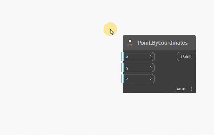
Node Autocomplete is a handy feature that lists viable nodes when you double click an input or output port, saving you the headache of searching through the library of hundreds or even thousands of nodes. With this release, we’re making it even more useful by adding Recommended Nodes, a new ranking method powered by machine learning. Ranking methods determine which nodes are shown when you trigger Node Autocomplete. Let’s briefly discuss the available ranking methods.
- Node Type Match, the existing method which you can still use, simply displays a list of nodes that match the triggering port’s data type. In previous versions, this method was known as Object Type and has been renamed.
- The Recommended Nodes method is more sophisticated and able to make more meaningful suggestions. These suggestions are based on common graph practices used in thousands of sample graphs, which the algorithm behind the method has analyzed for node usage and frequency. Each suggested node is ordered based on its confidence rating, which indicates the algorithm’s confidence that the node is a good choice for the port.
From the settings, you can choose to hide nodes that are below a given confidence level, with the option to unhide them from the Autocomplete results. Or, if you prefer, you can have your specified number of results shown by default, regardless of confidence level.
Note that recommendation model is currently trained on sample data from the Dynamo Dictionary, Dynamo host samples, internally sourced graphs, and graphs provided by users who opted in to sharing their graphs to improve Dynamo. We are continuing to improve our algorithm so that its suggestions will become more and more helpful over time.
Let’s take a look at the updates.
- [ 1 ] Enable or disable Node Autocomplete from Preferences > Features > Node Autocomplete.
- [ 2 ] Click the question mark icons to access detailed information about Node Autocomplete within the Dynamo documentation browser.
- [ 3 ] For the Recommended Nodes method, you can choose the maximum number of results displayed in the Autocomplete results window.
- [ 4 ] Choose a default ranking method to determine how nodes are selected for Node Autocomplete.
- [ 5 ] For the Recommended Nodes method, you can choose to hide nodes that don’t meet your specified confidence level. You can still access nodes below this level by clicking the Low Confidence header in the Autocomplete results.
- [ 6 ] Autocomplete dialog, showing recommended nodes for the x port.
- [ 7 ] Each recommended node is given a confidence rating. This indicates the algorithm’s confidence that the node is a good choice for the port.
- [ 8 ] Results below a given confidence level can be hidden under a Low Confidence header, based on your settings in [ 5 ]. Click the header to see all results.
- [ 9 ] Change result ranking methods by clicking the double arrows icon next to the search bar.

Node Autocomplete settings (left) and dialog (right)
Click each image below to see an animated GIF.
-

- Trigger Node Autocomplete by double clicking any port.

-

- Switching between ranking methods is easy: Click the arrows icon next to the search bar and select a method
-

- Node Autocomplete auto-wires your selected node. Convenient!

-

- If you’ve chosen to hide results below a given confidence level, they will be hidden behind a Low Confidence header in the Autocomplete results. Click the header to show all results.
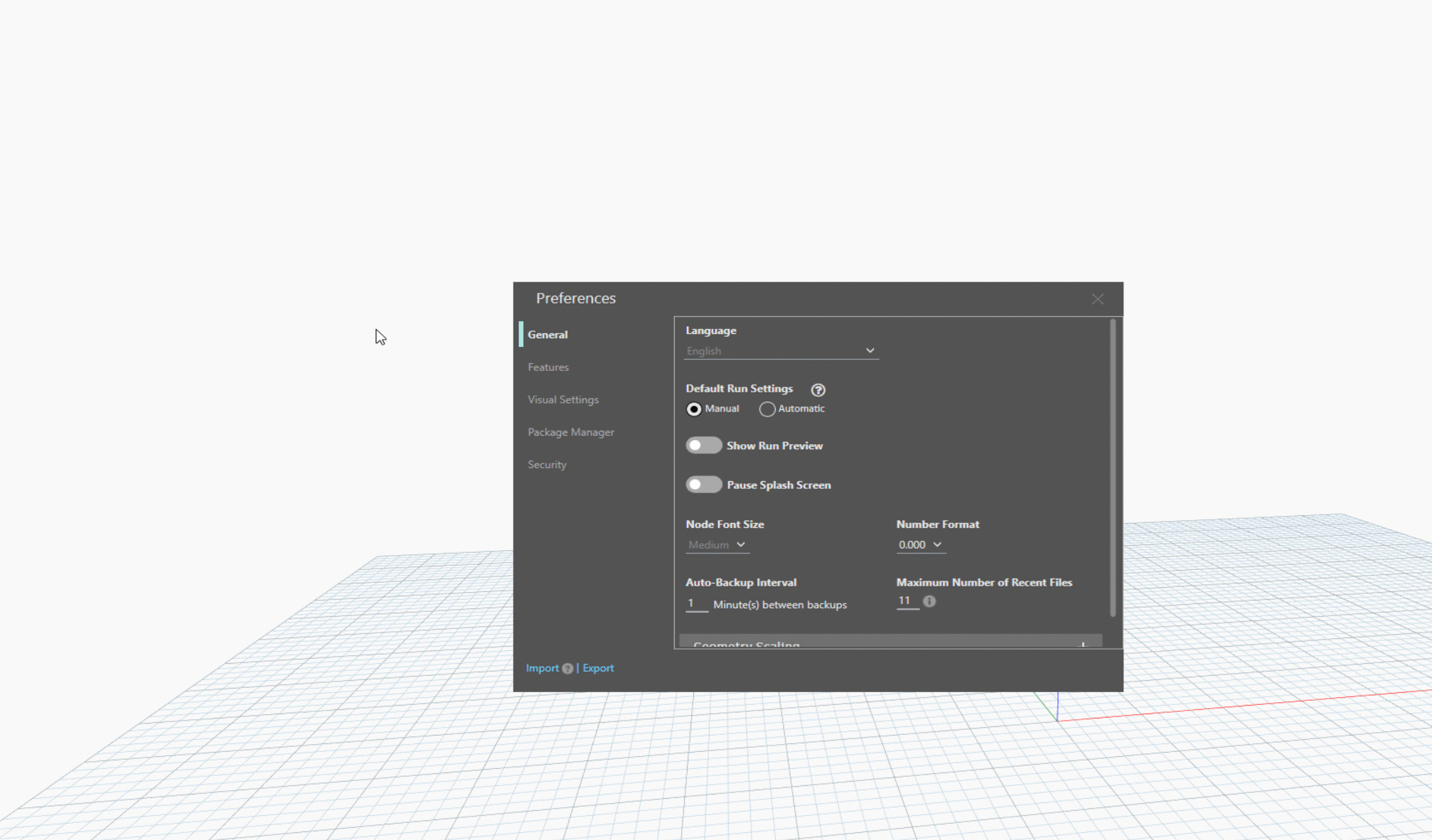
Help maintain office standards with settings import/export
Want to make sure that everyone at your company is using the same Dynamo settings? You’re now able to share and import settings with new options available from the splash screen (more on that below) and the Preferences panel.

Import and export Dynamo settings from the Preferences panel.
From the splash screen, you can select Import Settings to apply the settings before Dynamo starts up. For more information on importing settings via the splash screen, check out the section below.
Settings will be exported as an XML file to the folder of your choice. When importing, keep in mind that your existing settings will be overwritten. If you want to maintain a copy of your current settings before importing new ones, first export your existing settings. For any settings that are not available in the Preferences panel, such as the default Dynamo window size, you’ll need to restart Dynamo (and any host program you may be running) before the imported settings take effect.
And on the topic of settings, we’ve added several new settings to help you customize your Dynamo experience further. In the Preferences panel, you’ll find the following new options.
Available under General:
- Pause splash screen (more on the splash screen below)
- Auto-backup interval
- Maximum number of recent files: When reducing this number, keep in mind that any recent files above the chosen number will no longer be available in the Open Recent Files menu option or the Recent files list on the Dynamo landing page, until you open those files again.
Available under Features:
- Custom Python template file path
Available under Visual Settings > Display Settings:
- Enable hardware acceleration: Hardware acceleration can improve smoothness and overall performance by offloading work from central processing units (CPUs) to graphics display units (GPUs).
- Each of the display settings now includes a tooltip to explain what the setting does.
Making a splash
When you first launch Dynamo 2.17, you’ll be greeted by a brand new splash screen! Gone are the days of starting up Dynamo and waiting several seconds for anything to show up. The splash screen keeps you notified of Dynamo’s loading status with current status messages, a progress bar, and loading time.
At first launch, the splash screen will pause once it’s finished loading to present you with several options. You’ll be able to launch Dynamo manually, sign in to your Autodesk account, or import settings. If you’d rather skip this screen and have Dynamo launch automatically after loading is complete, you can select the “Don’t show this screen again” option. If you change your mind, you can always access this setting in Preferences, under General settings. Note that in addition to the splash screen, you can also sign in via the top navigation bar, and you can import settings from the Preferences > General panel.
- [ 1 ] A beautiful Dynamo illustration
- [ 2 ] Dynamo version
- [ 3 ] Loading progress bar
- [ 4 ] Current loading status
- [ 5 ] Current loading time, in milliseconds. Shows total loading time once loading is finished.
- [ 6 ] Launch Dynamo button
- [ 7 ] Sign in to (or out of) your Autodesk account
- [ 8 ] Import Dynamo settings
- [ 9 ] If you select this option, this screen will no longer be shown once loading is complete, and Dynamo will launch automatically. You can also edit this in Preferences.
- [ 10 ] Close button to exit out of the splash screen and cancel Dynamo launch

The two states of the new splash screen. On the left, loading is in progress. On the right, loading has completed.
The splash screen is included with Dynamo Core 2.17, as well as Alias, FormIt, and Robot Structural Analysis. To ensure stability, we are continuing to work on implementing the splash screen in Revit, Civil 3D, and Advance Steel. It’s planned to be released for these programs in a later version.
Pleased to make your acquaintance: Sign in to Dynamo
Sandbox users: You’ll now be able to sign in to your Autodesk account via Dynamo to publish packages as well as access other upcoming features that will require authentication. To sign in, you can click Sign In either on the splash screen or near the top right corner of the Dynamo window. When launching Dynamo via a host, such as Revit or Civil 3D, you’ll already be signed in and good to go.

Two ways to sign in to your Autodesk account via Dynamo. On the left, sign in via the link in the top right corner of Dynamo. On the right, sign in from the splash screen.
Open workspace, insert graph
Dynamo 2.17 unlocks the ability to insert graphs into the workspace. To insert a graph, go to File > Insert, and select a DYN file. If you already have nodes or a graph in the workspace, the inserted file content will appear below the existing content. To avoid any potential issues, your run mode will be changed to Manual, but you can certainly change it to Automatic if you have an understanding of how the updated graph will function.

Insert a graph with File > Insert. Inserted graphs will appear below any existing content in the workspace. Click the image to see an animation.
Picture this: Export graph images
Available now! With the Export Sample Images package, you can create images from Dynamo graphs. These images include both the graph workspace and the geometry output view, with the workspace cleaned up to ensure that the geometry output is not obstructed. You can create images from several graphs at once, or export an image from a graph that’s currently open in your workspace. Note that the tool applies Cleanup Node Layout to the graphs that it processes for image export, moving overlapping nodes as needed.
Are you a package author? Use this extension to quickly create documentation for your package. The Dynamo Team uses this in the Dynamo Dictionary to generate hundreds of images for our sample graph content!
To install Export Sample Images:
- Go to Packages in the Dynamo top menu, then Search for a Package.
- In the search bar, type in export sample images.
- Click Install, and click OK in the two confirmation dialogs to accept the download.
- Once the package is installed, you can access the Export Sample Images extension from the Extensions menu.
Let’s take a look at everything that Export Sample Images extension has to offer!
- [ 1 ] To export images from multiple graphs or a graph that’s not currently open, select a source folder. This folder should house all the graphs that you want to create images from.
- [ 2 ] Select a target folder, which is where the images will be created.
- [ 3 ] Use the checkboxes to control various aspects of the export process:
- Keep folder structure: The folder structure used in the source folder is duplicated in the target folder once the export is complete. If this option is unchecked, all images are created at the same level in the target folder.
- Resume previous session: Attempts to resume progress from a previous run. Progress is stored within the log.txt file in the target folder.
- Zoom out: Automatically zooms out in the geometry preview to ensure it’s visible in the image.
- Export current graph: Check this option and select a target folder to export an image from the graph that is currently open.
- [ 4 ] Once a source folder is selected, this message shows the number of graphs in the folder. During the export process, this message changes to notify you of the number of graphs processed.
- [ 5 ] Click Export to begin the image creation process.
- [ 6 ] This section shows a list of the graphs in the source folder and keeps you up to date on the export process. The circle icon turns into a checkmark once the graph has been processed, so you can keep an eye on progress.
- [ 7 ] During the export process, click Cancel to interrupt it.

Finally, check out this demo of Export Sample Images in action!

Click the above image to see an animation.
In-depth node documentation at your fingertips
You may already be familiar with the Documentation Browser extension, which provides more in-depth information about things like certain settings, errors and warnings, and nodes right inside Dynamo. In this release, you’ll find a new and improved Documentation Browser experience for node information, with a visual refresh, and updated content organization. Access the node information by selecting a node and pressing the F1 key.
Did you know that you can interact with the example file preview, just like a graph in the workspace? If the answer is no, you’re in good company—in previous versions, we didn’t make it obvious that you could manipulate the example. We’ve improved on that by adding new navigation controls to the example. You can also manipulate the example file with the usual workspace mouse controls if you prefer.
But we didn’t stop there. We’ve overhauled the way content is organized within the Documentation Browser, allowing you to more easily access the information you’re looking for. We’ve organized the content in up to three separate collapsible/expandable sections:
- Node Information, which includes both a short and detailed description (if any), original node name for renamed nodes, and the example file;
- Node Issue Help, which appears only when the node is in an error or warning state and documentation is available on the error or warning; and
- Inputs and Outputs, featuring tables with detailed information about each of the node’s input and output ports, such as name, type, description, default value, and data type.
Finally, we’ve applied some visual refresh touches to impose better visual hierarchy and modernized look and feel.
Here’s an overview of the updates:
- [ 1 ] The Node Information section at the top provides the node’s type and description. For many nodes, there is also in-depth information and an example file [ 2 ].
- [ 2 ] An example file for many node types is provided in the Node Information section. You can zoom in and out by using your mouse scroll wheel. When the example is zoomed in, you can pan around by dragging with the left mouse button. There are also control buttons provided in the top right corner of the example for zooming in, out, and to fit.
- [ 3 ] To open more sections, click their headers. You can have as many or as few sections open at a time as you’d like. By default, all sections are open.
- [ 4 ] If the node that you opened Documentation Browser from is in error or warning state, a Node Issue Help section will be available. If the section doesn’t appear and the node is in an error or warning state, there may not yet be documentation on the issue in question. The Node Issue help section provides a plain-language explanation of the issue, with suggestions for fixing it and a link to the Dynamo forum for more assistance.
- [ 5 ] In the Inputs and Outputs section, you’ll find a table for Inputs, showing a name, type, description, and default value for each of the node’s inputs (when available). You’ll find another table for Outputs, showing a name, description, and data type for each of the node’s outputs.
- [ 6] The independent sections of the Documentation Browser help you save space and focus on the content that’s relevant to you in the moment. In this example, all sections are closed. From here, you can open as many as you wish.

The updated Documentation Browser, with new expandable and collapsible sections.
So, next time you encounter a node you’d like to know more about, simply select it, hit F1, and start learning!
Improving the nodal landscape
Watch 3D node improvements
Watch 3D now shows geometry for all directly connected nodes, even if their preview is turned off. Watch 3D camera and size are also saved with the Dynamo file.

Watch 3D node displaying geometry from a node with preview off
Increase font size in Dynamo’s Python editor
You can now increase or decrease the font size in Dynamo’s Python editor. Hold CTRL and use the scroll wheel on your mouse to adjust the text size to your preference.
Jump to connected nodes from wires
This one might save you some scrolling time: To jump to a connected node, right-click a wire and select Navigate Upstream or Navigate Downstream.

New Navigate Upstream and Navigate Downstream options in a wire’s context menu
Set a default font size for your group styles
In addition to group name and color, you can set a default font size for your custom groups in Preferences > Visual Settings > Group Styles. This selection will determine the size of the group’s title within the workspace. Click the drop-down to select a font size between 14 and 96. Your selection will be saved automatically.
Creating a custom group style and selecting a font size. Click the image to see an animation. Note the difference between the default group and custom group title font sizes.
Epic stuff! So where can I grab Dynamo 2.17?
Dynamo 2.17 will be made available in our host integrations at a future date and can be explored right now through the dynamobuilds.com website or the Github build page – available in the Sandbox version of Dynamo.
If you’re curious, you can also read our Release Notes
For more information on other minor features, bug fixes, and known issues in Dynamo 2.17, go check out our release notes!
A big shout-out to everyone who contributed to the release and the entire Dynamo community for continuing to support our work. As always, please let us know if you have any feedback or suggestions.
The Dynamo Team